Episode 1. How the Raptors and the Grizzlies Revived the NBA.
How both new Canadian franchises led the NBA’s international expansion. From an article originally written by Matt Giles in June 7, 2019 of LONGREADS.
Tom O’Grady is perhaps the most influential — albeit unknown — individual in NBA history, or at least in the league’s aesthetic history. Over 30 years ago, the NBA added the Toronto Raptors and the Vancouver Grizzlies to the league, the first ever international expansion for a sport whose popularity at the time was waning. Michael Jordan had abruptly retired prior to the 1993-94 season, TV ratings were flat for a two-year period, and NBA’s most popular teams lacked any panache or star power. As NBA vice president Brian McIntyre told Sports Illustrated at the time, “The Knicks’ [won the 1994 Eastern Conference Finals] style of play is like the Woody Hayes Ohio State football... three yards and a cloud of dust. It doesn’t do much for core basketball fans or casual sports fans.”
“There’s no character to the Toronto Raptors uniforms anymore. It’s clean, yes, but not eye-catching at all, especially compared with the colorful and popular original Raptors purple and red classics! The logo doesn’t jump off the shelf. Their uniforms today might as well belong to an intramural basketball team.” - Tom O’Grady, NBA Creative Director.
But the addition of the Raptors and the Grizzlies — the first time the NBA had expanded since the late 1980s — was intended to help boost the NBA’s image (not to mention inject a healthy financial infusion of $125 million per franchise). O’Grady, who joined the NBA as its first creative director in 1990, had been tasked with overseeing the naming of the teams and the brand identities for the two new teams.

In Your Face Bold, Brash Logos.
Bright, engaging “in your face” logo designs dominated the 1990s team branding aesthetic, which helped to explode sales in the sports licensed product business. But the addition of the Raptors and the Grizzlies — the first time the NBA had expanded since the late 1980s — was intended to help boost the NBA’s image (not to mention inject a healthy financial infusion of $125 million per franchise). O’Grady, who joined the NBA as its’ first creative director in 1990, had been tasked with overseeing the naming of the two teams and the brand identities for the two new teams.

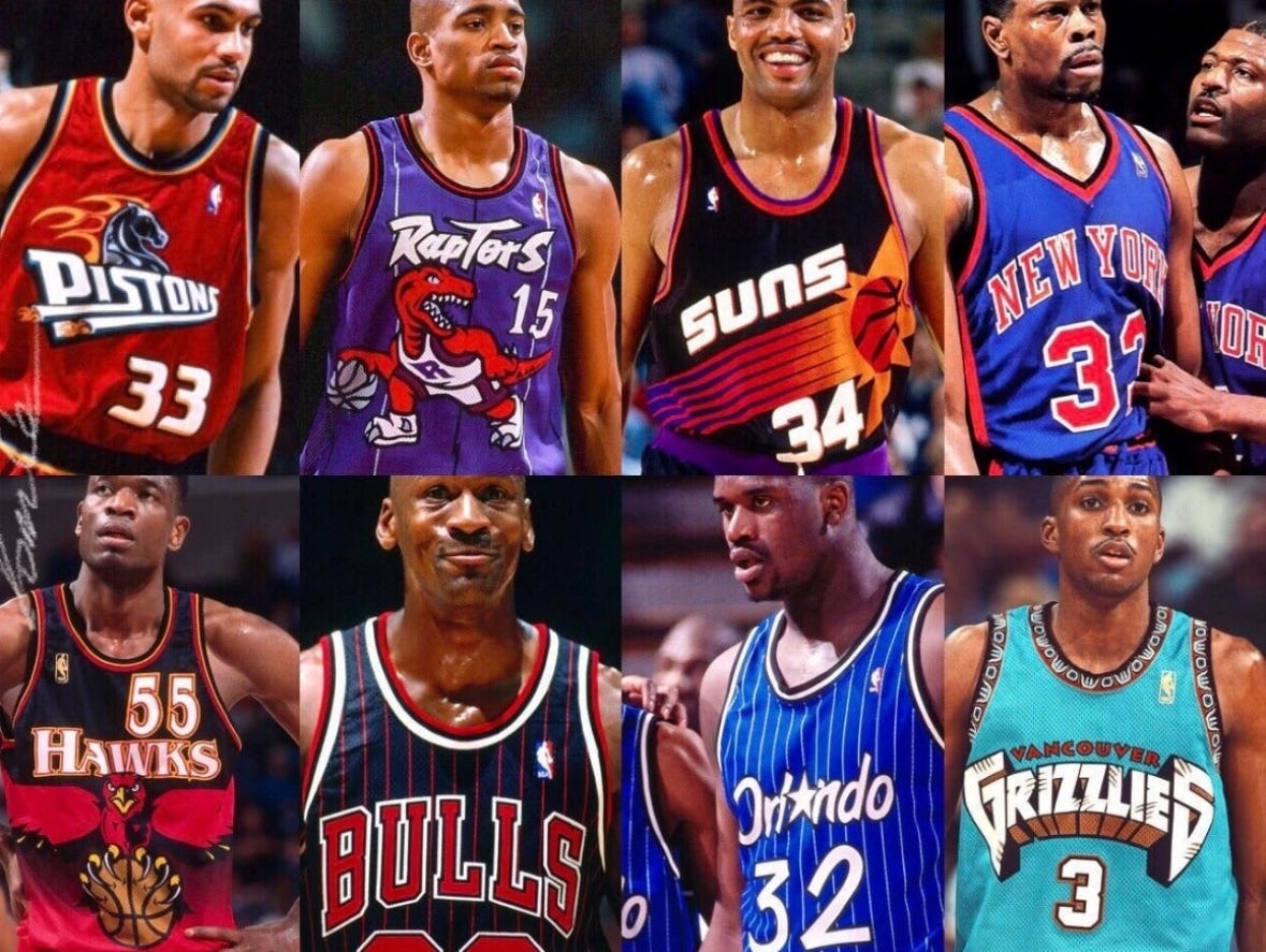
At the time, the League had already been undergoing a bold stylistic shift: The logos and uniforms of teams like the Milwaukee Bucks, Phoenix Suns, Atlanta Hawks, and Detroit Pistons all went through complete conceptual redesigns, an led by O’Grady and his 20 person NBA Creative services team. Many of those franchises had well established identities, but teams were aware of the popularity of the new trends in sports design and were looking for rebrands —whereas the Raptors and Grizzlies provided O’Grady and his team at NBA Properties in Secaucus, New Jersey with a blank canvas and the rarest of high visibility sports branding opportunities, the chance to give brand birth to not one but two new NBA franchises… both in Canada.
When O’Grady first began working on the Toronto brand identity in late 1993, he knew everything was in play. He had a wide latitude to make creative decisions. “I’m the one that made the creative calls and brand direction,” says O’Grady. And yet, “I’m going to, then commissioner, David Stern’s offices and taking the heat big time in case it’s not a huge success.”
Welcome to Jurassic Park.
Toronto owner John Bitove and his partners wanted a team name and logo that went beyond the Canadian border, and spent months studying iconic brands like Disney and McDonald’s. John was 100% focused on the Canadian youth demo. The reality of capturing fans over 50 years old was a non-starter. The expansion team was going up against the NHL Maple Leafs (and hockey and religion are neck-in-neck in popularity in Canada), and MLB Blue Jays (who had just won back-to-back World Series titles), so introducing a new team was a huge challenge. The NBA (and basketball) was not a bid deal in Canada, so the franchise had to find unique ways to enter marketplace.
When Jurassic Park debuted in June 1993, original NBA Toronto expansion team owner John Bitove, Jr. realized he had found the perfect creative direction. “John was predisposed to a name that would resonate universally with kids, and what appeals to kids more than dinosaurs...” said Tom Mayenknecht, the Raptors’s director of communications in 1994.
Huskies? Lakelanders? Eh’s? T-Rex?
Without the hype and critical praise that accompanied the Steven Spielberg’s film, it’s unlikely Raptors would have been a unanimous name selection. Instead, we might have be cheering for the Toronto Huskies. Prior to the NBA, the Huskies represented the city in the Basketball Association of America in the 1940s. The pop culture craze of Jurassic Park context predisposed the team to follow a dinosaur themed concept.
That April, The Star and radio station CFRB 1010 organized a team naming contest. Several dozen potential names were nominated, a list which included the Lakelanders, the Trilliums (Ontario’s official flower), and the Canadian Eh’s, but O’Grady claims that despite the ten names that were shortlisted, the franchise already knew which direction it was headed.
“They were going to be the Raptors all along. The naming contest was a smoke screen to allow people believe they were part of the decision making process... but ultimately the name Raptors always the winner.“ -Tom Mayenknecht, Raptors Communications Director.
Even though Bitove and others were considering the possibility of naming the team the Toronto T-Rex, O’Grady says the franchise was directed to focus on raptors, like birds of prey, they travel in packs of six to 10. “If the name Raptors barely registered with the public vote, then Bitove might have conducted focus groups — but typically focus groups are sanity checks, just ensuring colossal mistakes are not made.
Barney Can Kiss My Ass.
True to form, the logo reflected the personality and exuberance that the new franchise hoped to imbue upon its NBA debut. “The Raptor is quirky, which is why it is timeless: the snarling teeth and claws sticking out of sneakers gives the logo an attitude, but the other elements — like dribbling a basketball — is endearing,” says O’Grady. In the Slam‘s oral history, O’Grady further elaborated, “The traditionalists hate[d] it. It’s not classic, it’s not the Celtics or Lakers — well, no kidding. The younger kids love it because it’s so different and so fresh and it’s so anti-traditional sports design.”
The wildly popular logo features a velociraptor dribbling a basketball, wearing shoes with claws protruding from them. The raptor was set on a circular field with seven triangular edges above it. The field was black with a purple lining, and the word 'Raptors' was written in silver. This was the logo from 1995-1996 through 2007-2008, during the iconic days of Vince Carter and Tracy McGrady.
The Happy Meal Box of Uniform Designs.
According to a Slam magazine oral history of the Raptors’s logo, Toronto owner John Bitove and his partners wanted a team name and logo that went beyond the Canadian border, and spent months studying iconic brands like Disney and McDonald’s. Or, as O’Grady says, develop what could be most easily described as the “happy meal box of uniform designs.”
When the Toronto Raptors franchise officially selected its logo and inaugural uniforms, the designs were intentionally designed as a short-term strategy, said O’Grady. The bold visual identity—featuring a vibrant color palette of red, purple, black, and “Naismith Silver” (a nod to Canadian James Naismith, inventor of basketball)—paired with “wacky, funky lettering,” was designed to ignite excitement for the expansion team in the mid-1990s. However, the original ownership always envisioned a future rebrand. “Those elements would eventually shift in a new direction,” O’Grady notes. “The uniforms were temporary—a placeholder until the team established itself competitively.”
When the Raptors celebrated their first NBA Championship in 2019, their original dinosaur aesthetic served as a nostalgic relic of the franchise’s roots and how far the Raptors franchise had come since 1994.
Reflecting on the original Toronto uniform, O’Grady remarks, “It couldn’t be introduced today. It’s too over-the-top, “waaaay too 90s.” The statement underscores how the Raptors’ early branding, though fleeting, encapsulated the playful, experimental spirit of the decade—a deliberate plan to captivate fans during the team’s formative years before evolving into a more refined identity aligned with its rising stature.
Within the first month of the unveiling of the Toronto Raptors new logos, uniforms and team apparel such as hats and t-shirts, the NBA sold over $20 million worth of team branded merchandise.
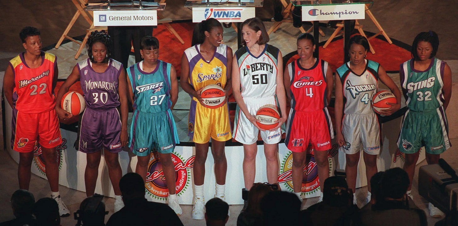
Following Toronto’s launch, O’Grady assumed he’d return to the previous assignment, the one he was working on before anyone ever heard of Naismith Silver and Globoraptors — designing logos and uniforms for each of the eight WNBA franchises, a league that would debut in 1996 (“An enormous amount of team branding,” he says).

But soon after he returned to Secaucus, commissioner Stern called him to his office: Vancouver wanted to also launch its own NBA franchise — the league’s 29th. The catch? While O’Grady had nine months to conceptualize the Raptors’s design, he had just eight weeks to design the new NBA Vancouver brand identity. “It was an enormous ask, to do that amount of work [to create a] brand new identity,” he says.
The nickname GRIZZLIES was chosen for a reason. Besides being a local animal, the grizzly bears are known for their strength, ferocity, fearlessness, and power. They are quite intelligent and will go to any means to protect their offspring and territory. The team proved that it can overcome obstacles and reach the success and fame it deserves. Their failure and very little luck in their original home city of Vancouver did not stop them from moving and trying their best again in the new place.
Whereas Toronto felt comfortable affording O’Grady a freedom to pursue abstract concepts, Vancouver preferred a more literal logo design, and asked the NBA’s creative director to explicitly link the new franchise with the history of the Pacific Northwest. One possible option — the Vancouver Mounties — was quickly jettisoned, and O’Grady was now focused on a decided upon a concept around the Vancouver Grizzlies. “The franchise wanted to be provincial and connected to British Columbia,” says O’Grady. “They wanted something classic that would have a long shelf life.”
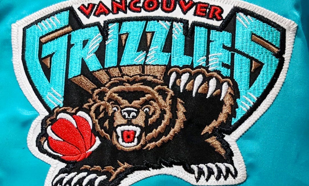
Fully fleshed out via pencil sketches, the image of a snarling grizzly came alive as a growling bear in mid-crouch, with one claw clutching a basketball and the other ready to strike an opposing team. Like the Raptors brand, the logo had real attitude, with an animated bear holding a basketball in its oversized paw.
Working with the Haida community.
“We were introduced to a Haida chief in the British Columbia region of Canada who worked closely my NBA Creative Services group to explain the culture, the background and the followings of his people,” O’Grady said.
The Haida are an Indigenous people of the Pacific Northwest Coast of North America, with their traditional territory encompassing Haida Gwaii (formerly Queen Charlotte Islands) in British Columbia, Canada, and parts of southeastern Alaska. They are known for their rich culture, art, and connection to the land and sea.
The Haida chief provided some loose sketches of how to pay homage to the area; they really helped us understand the colors and the names. When starting to get into the color scheme, their group narrowed down the series of colors that were reflective of the culture, especially the grizzly bear in that region.
“The turquoise, for us, represents the sky and the heavens. The black is the grain and the earth. The brown is the bear itself, and the red is the blood and the soul of our tribes.” -Haida chief representative.
During the time of the Vancouver Grizzlies, the team kept its logo on their uniforms more or less the same until its relocation in 2001. Between 1995 and 1999, their home uniforms were white with wordmarks in turquoise and black, and the angry grizzly logo was on the shorts. The away uniform was turquoise with white wordmark. In season 2000-2001, the uniforms changed color to black, and the logo on the shorts was switched out to an angry grizzly grabbing the capital “G.”
There has long been a continuous feeling of nostalgia for the old Vancouver Grizzlies logo. In the last few years, there has been an upsurge in retro sports logos, with most fans celebrating various design elements unique to the Grizzlies' branding during their short tenure in Canada.
While Toronto’s logo and design would last for almost two decades before the team unveiled a new uniform prior to the 2015 season, the Grizzlies made a change upon relocating to Memphis in 2001. The Grizzly remained, but the color palette that had perfectly aligned with the Pacific Northwest and British Columbia was now out of place — the colorways were jettisoned for various shades of blue and the logo transformed into a flinty looking bear.
“The original Vancouver Grizzlies expansion season logo is a very popular vintage throwback design and still sells very well over a range of NBA licensed products.” laments O’Grady. “It’s over 30 years later… but wow, do I still miss those fun logos from the colorful creative ‘90s!” -The End


