

Giants Script Connects with San Fran Fans.
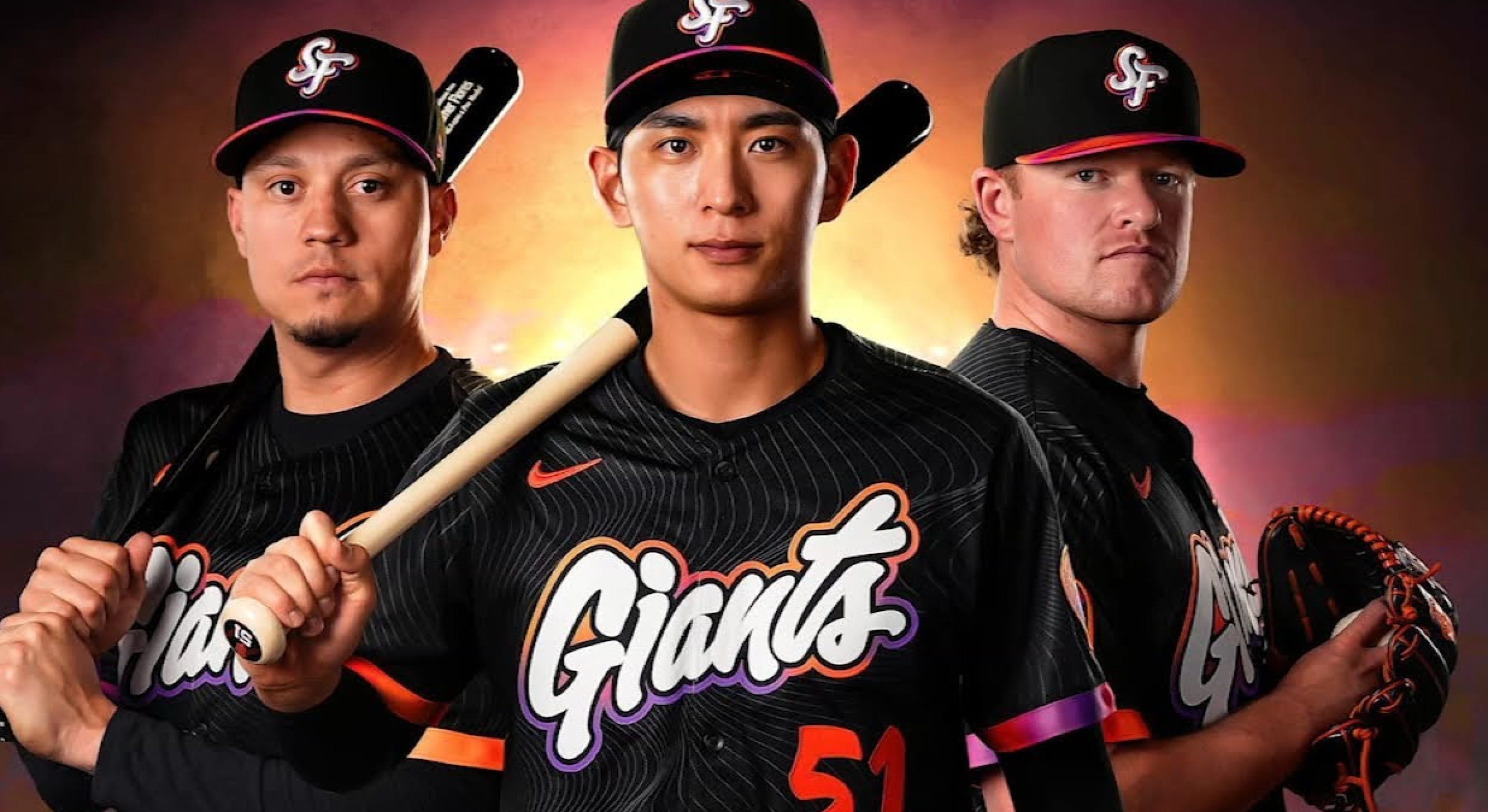
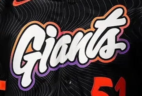
The San Francisco Giants recently unveiled their second version of the controversial Major League Baseball City Connect uniforms, and like many in the sports design community, I was struck by the most immediate and unusual feature: a large, bubbly, rounded script across the front chest. It was “giant,” and somewhat “promotional” in its’ call to action styling, a SAVE 50% offer blurb!
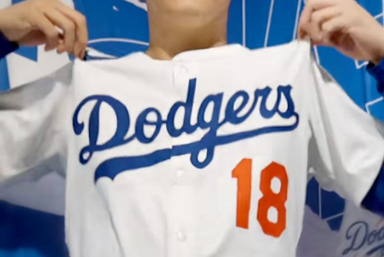
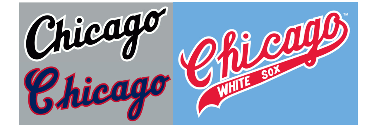
The Giants white script lettering with the multi-color outline is not a brushstroke homage to 1950’s MLB ball clubs. It’s not an “all-time classic” Dodgers script or the familiar White Sox “Chicago” script. It didn’t ride the hard baseline and tail swashes of traditional US sports scripts so commonplace in sports. It’s got it’s own personality!
The Giants City Connect features a script font… but it feels more casual and random than standard scripts and in my opinion, makes it more engaging. Some have called it “toothpaste tube-like…” — but there’s something undeniably fresh and interestingly different about it. The Giants “smoothness” funky script stands apart from traditional repetitive baseball scripts.
The Same… But Different.
As a designer who’s spent decades in the world of sports branding, I’m always chasing that next “thing”— and pushing jersey lettering to be both functional yet unique to feel proprietary to that team. I’ve built a reputation on making something “different”… “unexpected” yet reflective of the teams’ brand identity.
Script writing has always been a deeply emotional element in sports branding. It’s the handwriting of a franchise, literally and metaphorically. And over the past 75 years, the use of script on sports uniforms has gone from conservative and formal, to more expressive and exaggerated … to retro-chic and recently… digitally re-imagined.
The latest City Connect uniform from the Giants feels like a gentle rebellion against all of that—it’s 100% script, yes… but not true “sports script.” And that’s what makes it notable, it introduces a freshness through execution. Yes, it’s different and interesting.
What Is Script, Really?
Let’s start with a definition. Script, at its core, is cursive lettering (penmanship) where the characters are connected in a flow, mimicking natural handwriting. In classic calligraphy, this style emphasizes fluidity, ornamentation, and personality. In uniform design, script often serves to humanize and differentiate, evoking emotion, heritage, and/or swagger. Often, it’s the most creative design element of the entire uniform.
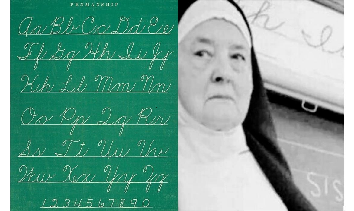
Boomers like myself, who grew up learning “proper” penmanship in Catholic school, remember the importance of the baseline, x-height, and ascender lines —these principles are the backbone of good script design. Who knew nuns were teaching the basic and important principles of good uniform design? And yes, I got A’s in my penmanship studies… without a doubt, my favorite class in grade school.
In “sports” script lettering, the capital letter kicks things off with drama, followed by a series of rhythmically connected lowercase letters, often punctuated with an underline “tail” which anchors the design and accentuates the name.
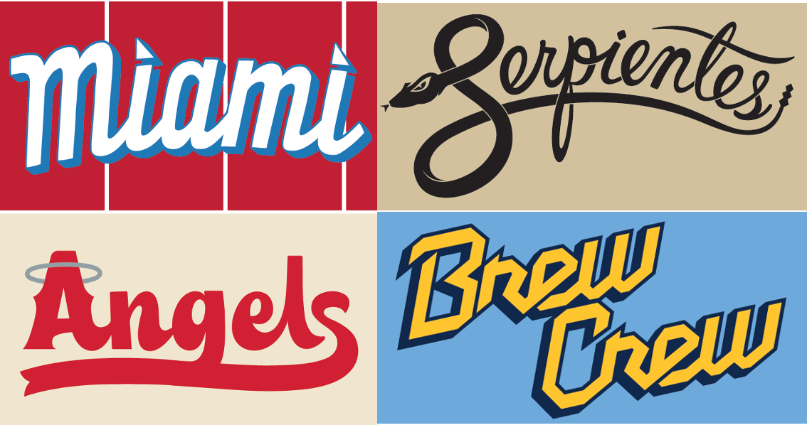
That tail, by the way, is the “exclamation point” of many of the classic American sports team scripts. It’s not just a flourish—it’s a subtle message. A visual way of saying, “This is a team. A collective.” Think “Dodgers.” Think “Braves.” Think “Phillies.”
The Early Days of Script.
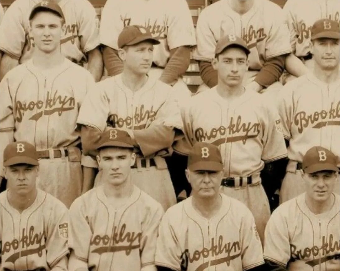
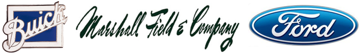
Script lettering first began appearing on baseball uniforms in the early 1930s, often evoking the same elegant cursive files seen in department store signage and automobile logos of the era. Such ornate scripts become central to our visual conscience.
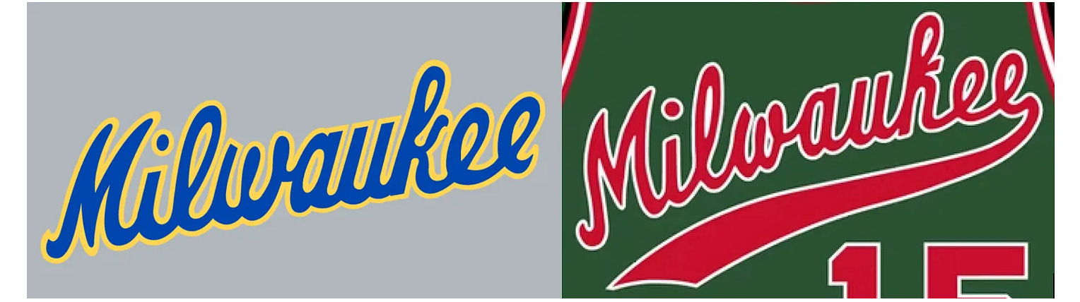
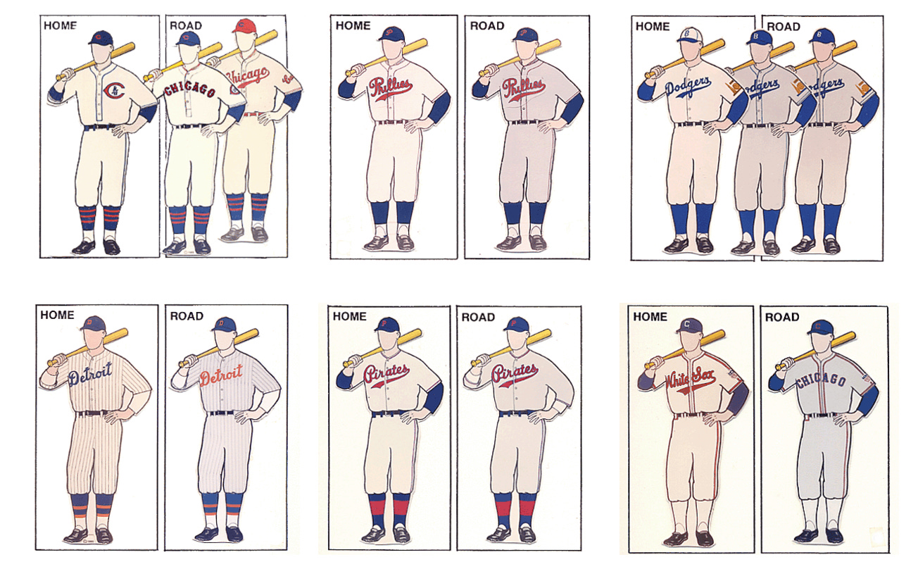
The Dodgers’ script, created in 1938 and refined through it’s long life, remains one of the most iconic examples—its’ sweeping “D” and balanced flow have rarely been modified. The Tigers, Cardinals, White Sox, Cubs, Phillies and Pirates followed similar routes, adopting classic scripts that leaned on consistency and gravitas.
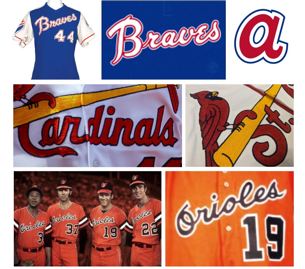
But the real boom in expressive, stylized script began in the late ’60s and early ’70s, when all four pro league teams started experimenting with funkier, louder, less conservative team uniform designs. Atlanta sported interesting raglan sleeve jerseys with a complex Braves script font. Baltimore going all in on their bright orange uniforms with a snappy Orioles script. Still, other teams such as the Cardinals classic script remains timeless. Script is more interesting when it has its’ own unique style, subtle touches and interesting flourishes.
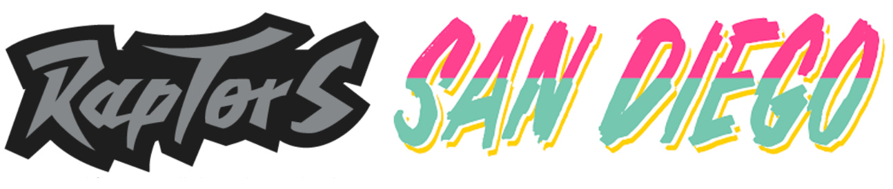
By the 1990s, script had evolved into two creative paths. The classics teams sticking to their roots (Dodgers, Tigers, Braves), and the radicals—teams like the 90’s Raptors and or the more recent 2023 City Connect Padres fiesta font —pushing into edgier-custom lettered scripts or hand lettered variations such as S A N D I E G O.
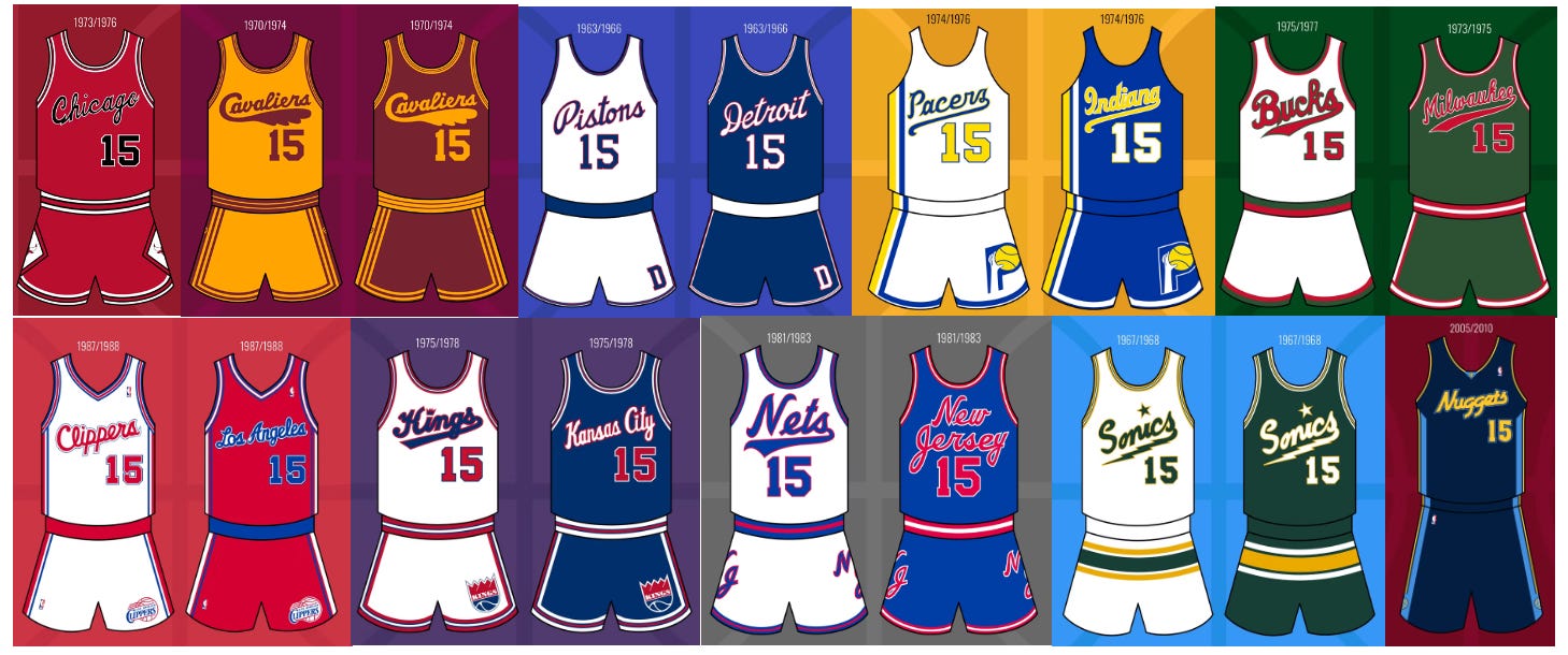
Major League Baseball is the undisputed leader of script treatments for uniforms. However, and surprisingly — throughout ABA and NBA history —many basketball teams have worn well-designed script treatments. NBA legacy teams such as the Bulls, Pistons, Pacers, Bucks, Sonics and others have worn sharp script treatments emblazoned across the front of their tank tops. And big kudos to the ‘70s Sonics for scoring big points for creativity by featuring a lightning bolt as their under-tail!
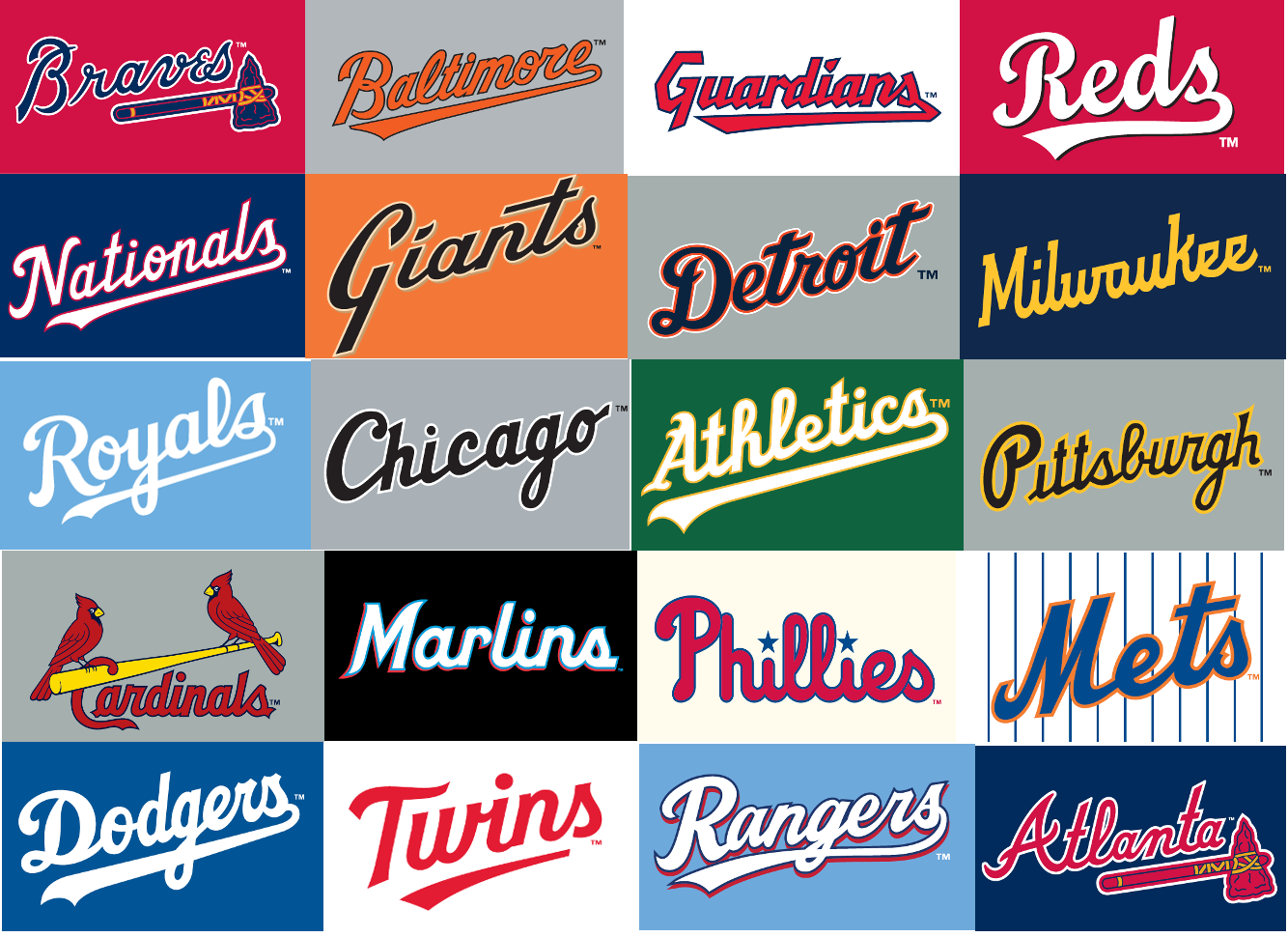
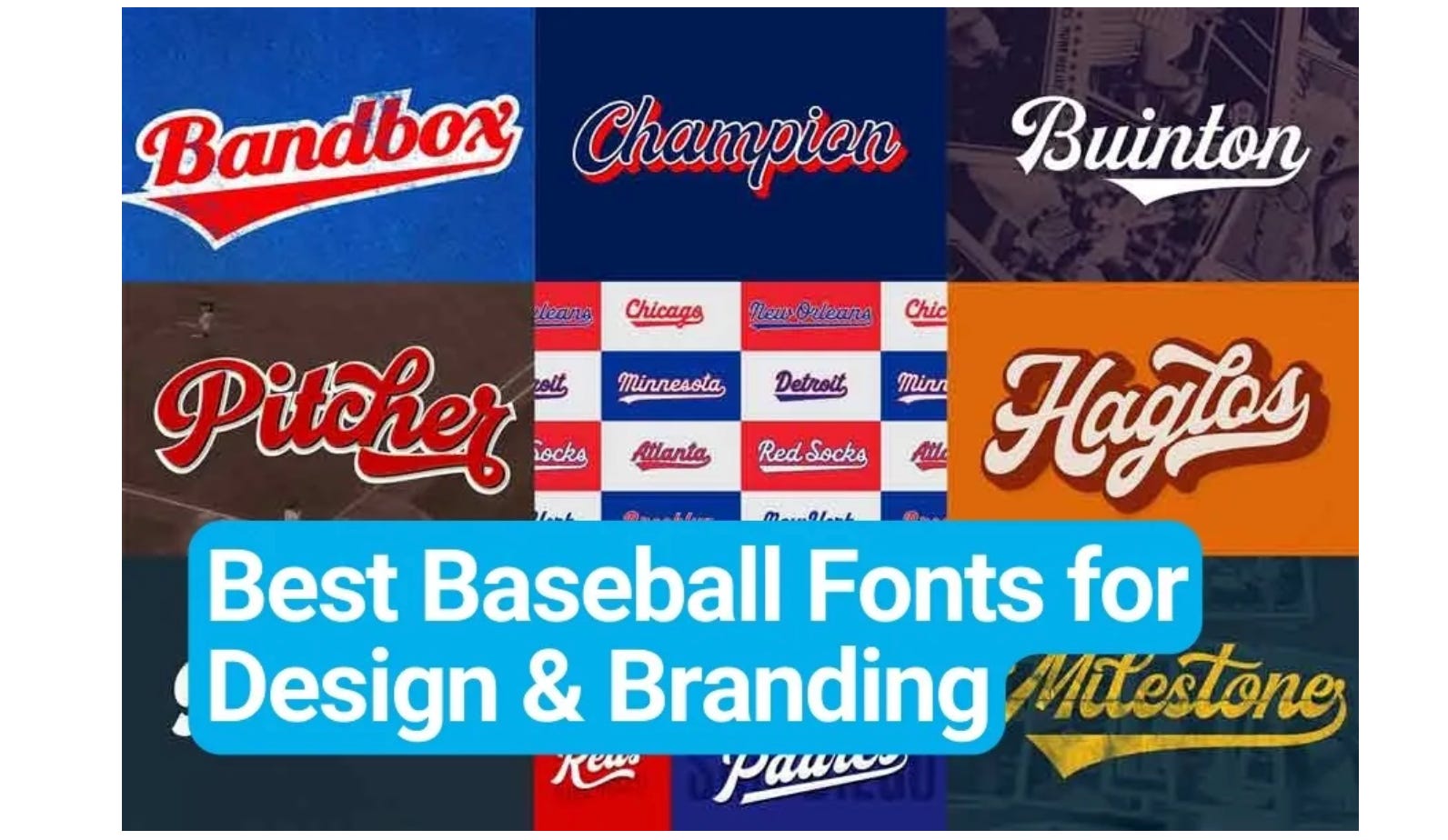
Today, ‘baseball script” fonts are the most popular sports-themed typeface. 19 MLB teams: the A’s, Brewers, Cardinals, Dodgers, Giants, Guardians, Marlins, Mets, Nationals, Orioles, Phillies, Pirates, Rangers, Reds, Royals, Tigers, Twins, White Sox, and Braves all feature script somewhere in their identity. And script usage extends beyond Major League Baseball. College baseball, women’s college softball, minor league baseball and hundreds of high schools teams are all about the script style…
My Own Brush with Script: 1996 USA Basketball.
My personal contribution to script wasn’t in baseball—it came in 1996 for USA Basketball. The NBA was the licensing agent for both the USA Men’s and USA Women’s Olympic teams (both gold medal winners!). I was responsible for designing both teams’ white and dark uniforms, a career highlight. In 1995, I pitched USA Basketball at moving away from the conservative official looking USA BASKETBALL font, and moving towards a script font. I believed it was a more stylish option and… right in the middle of the 1990’s when sports design was rapidly evolving.
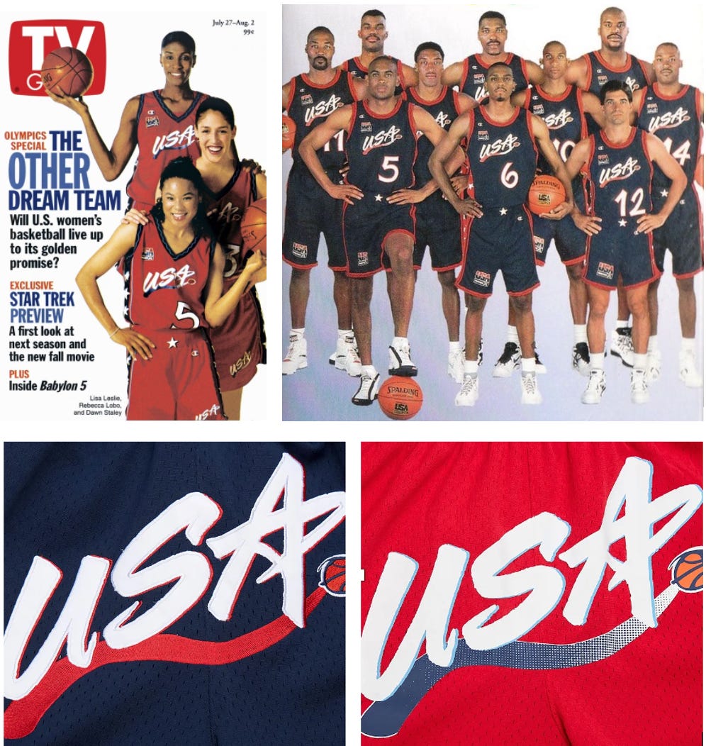
Unlike the traditional cursive “connected-ness” of script, the new “USA” used an all-caps treatment generating the energy of script without being predictably cursive. Within the “A” in USA, I scripted a star as a patriotic salute to finish off the design. It’s become one of the most beloved USA Basketball uniforms in Olympic history.
The New Wave: Script in the City Connect Era.
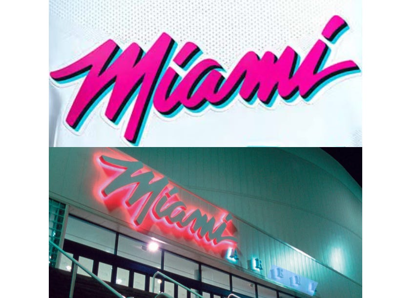
Fast forward to the present. The NBA’s oft-maligned City Connect uniform program has opened the door for script to be reborn in a variety of styles. The Miami Heats’ neon-lit “Vice” script (inspired from Miami Arena’s signage) proved that script doesn’t have to be “baseball-like” to resonate. It can be fun, theatrical, even campy.
Nike’s approach with these uniforms has been to lean heavily into city identity and culture, allowing script to play a role not just in team naming, but in storytelling.
Nikes’ MLB City Connect has redefined the pre-conceived concept of a script design. The San Francisco Giants’ smooth, bubbly script-style font—confirms script is no longer just a classic baseball lettering legacy play. It’s an opportunity for reinvention, exploration and whimsical ways to make new brand impressions. It’s a obvious way to drive additional sales to Nike, the leagues and its’ teams, which have been profitable.
Why the Giants’ Script Matters.
Which brings us back to the Giants. Their new City Connect script may not please traditionalists. But in many ways, it represents a new moment: a shift away from hardline sports aesthetics and toward a more expressive, culture-infused language. It’s casual. Approachable. It’s meant to feel like part of the city, not just the franchise.
The Giants’ 2025 City Connect look might not land in the Hall of Fame of scripts, but it marks a turning point—another example of how sports branding evolves when the rules are pushed and re-imagined.
That’s the core of what script can do in sports branding when used intentionally—it speaks. It personalizes. And sometimes, as in this case, it even disarms.
The Final Out.
There’s a temptation to over-analyze every curve of a letter-form—and yes, script deserves that kind of respect. But sometimes, it’s worth taking a giant step back and simply observing how script evolves over time: from chalkboards to scoreboards, from traditional to transformational.
One small step for script, one giant leap for uniform creativity. -The End.