


Episode 18. It's a Numbers Game.
Brand Advantages of Custom Number Fonts Over Block Style Numbers.

Welcome to Episode 18 of the Sports Branding Substack. Hope you are enjoying the myriad of different sports branding subjects we’re covering and the deep dive case studies we’ve “stacked” since March. We’re approaching 200 subscribers (WOW) and appreciate your support! If there’s a sports branding topic you’d like us to cover, please reach out and we’ll do our best to generate a stack from your request.
Custom Number Fonts in Sports Branding.
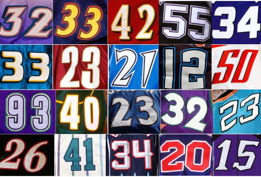
In this episode, we’re taking a closer look at one of the most overlooked, yet incredibly critical elements in sports uniform design: team number fonts. Specifically, we are amplifying the reasons why custom number fonts on jerseys provide teams a branding advantage —versus those who rely on standard off-the-shelf “block” stock numbers.
While block numbers—like the classic varsity or pro-style digits—have long been the industry standard, they often feel generic, interchangeable, and devoid of any team brand identity. On the other hand, custom numbers give teams a unique visual signature reinforcing their brand DNA, adding intrinsic value, and setting them apart both on the field and in the retail marketplace with their own proprietary digits.
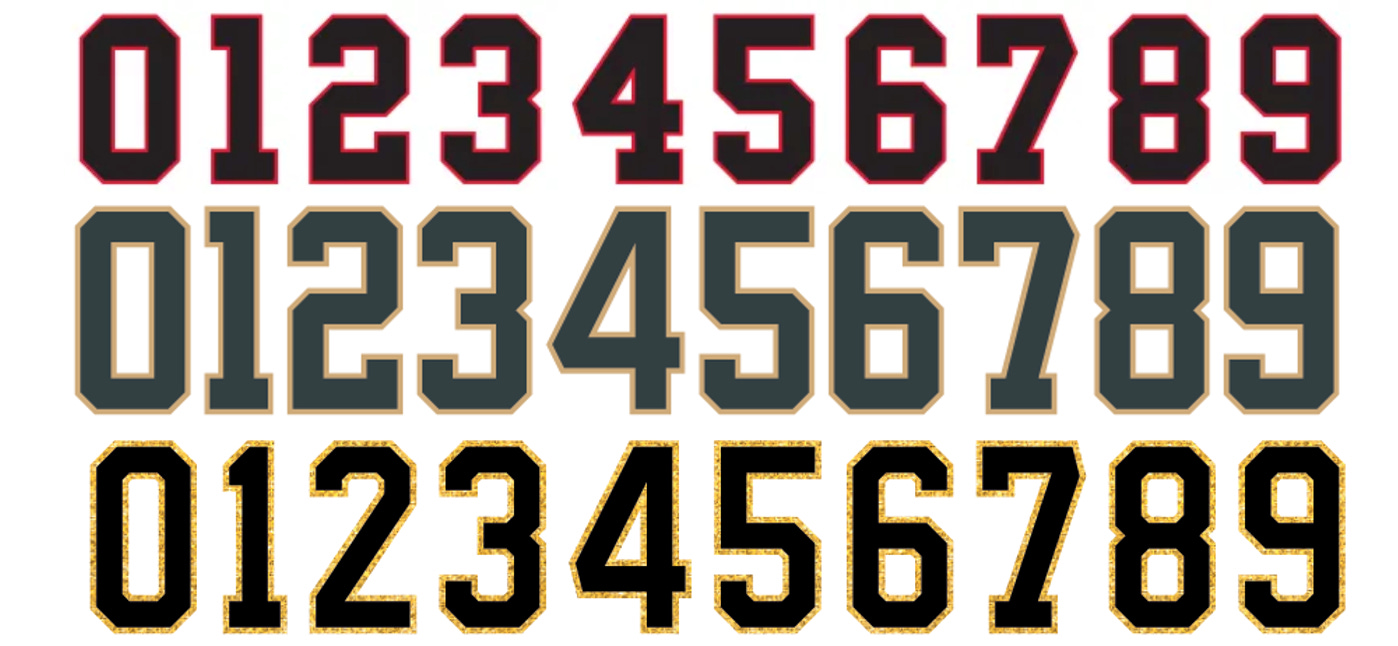
What Are Block Numbers Anyway?
If you’ve ever watched a high school football game, flipped through a vintage sports athletic-wear catalog, or even walked into a big-box sporting goods store, chances are you’ve seen them: big, bold block numbers… which are the go-to, one-size-fits-all number font style used for literally thousands of pro and amatuer team uniforms.

If you’ve played competitive team sports at any level, you’ve probably worn a jersey with standard block numbers on the back of your shirt…
Block numbers are typically bold, rectangular, and straightforward—with 45 degree angled corners, slab serif start and end points, uniformed stroke widths, without unique flair or personality. They were designed for function, but definitely not for any flavor. Vanilla numbers in an often visually colorful uniform landscape.

Want to see lots and lots of examples of block numbers? Google: “block numbers font” and click image results. You’ll get a visual buffet of styles: solid block, full block, block inline, block with drop shadow, and a few digital scoreboard examples. It’s a greatest hits collection of block stock typefaces,100% reliable, but very forgettable.

Before the Internet, ordering sports uniforms was a manual process with limited options compared to today. Teams—typically through coaches, athletic directors, or equipment managers—would browse printed catalogs like this spread from Sand Knit, select a uniform style based on sport, fabric, trim, and color options, then fill out an actual “paper” order form. Very charming and very old school. Who’s got a pen?
Teams would either hand over their team uniforms order to a regional team outfitting sales representative or mail it in their form, often accompanied by a check! A classic mail order system. Old school.

Uniform design choices/options were intentionally limited to avoid confusion and reduce production errors. Teams had only a handful of jersey styles to choose from, and block number fonts—plain, bold, and highly legible—were the industry standard. These fonts were not only easy to apply to jerseys but also easy to read from a distance, which suited the needs of officials, fans, and broadcasters alike. Optional upgrades, like single or double outlines or bold drop-shadows around the numbers came at a nominal extra charge fee—but preserved the block style simplicity.
A common visual denominator in apparel catalogs are block number fonts, with or without outlines. Block number standardization on jerseys was largely based on cost, accuracy and ease of manufacturing.
This streamlined ordering system, coupled with the prevalence of block numbers, helped homogenized the look of sports teams during this era (for better or worse) and kept uniform production consistent, affordable and yes, pretty manageable overall.
Similar… But Different.

Some legendary teams, such as the Chicago Cubs and Bears have worn team numbers which have very similar characteristics to block numbers, but have been altered to have their own unique idiosyncrasies. Our informal research suggests fellow Chicago sports fans appreciate the uniqueness of the clubs custom number fonts.
From slight tweaks in stroke widths to fully tailored number systems by echoing a team’s history, city, or design language, custom numbers help to create a “cohesive” uniform brand identity system all while reinforcing the teams’ core brand identity. A unique signature by the numbers.


Why Do Teams Default to Block Numbers?
When finalizing the look of a team uniform, selecting a custom number font seems like a small detail — but like selecting wall paint or artwork in a home, it’s often the finishing touch that gives a uniform its personality. Still, despite the opportunity to create something unique, many teams default to basic, off-the-shelf block numbers.
Why?
1. It’s the Path of Least Resistance. The standard block number is a familiar, safe, and a non-subjective choice. It’s widely available, immediately legible, and requires no design effort. When timelines are tight or branding isn’t a high priority, block numbers are the default, and they are extremely legible when contrasted against the jersey color. Episode 14 of the Sports Branding Substack, “Who's That in Right Field?” details the crime of non-contrasting player numbers. Take a look for the reasons why.
2. Cost and Production Efficiency. Custom number fonts require more effort to design, produce, and manufacture. Stock block numbers are already digitized and ready to go. They’re cheaper to produce, easier to source, and less complicated for uniform suppliers to execute at scale.
3. Fans Often Don’t Know the Difference. To the average fan, a number is a number. While sports uniform designers and branding experts know how much character a custom number provides, most fans aren’t aware of the difference — or why it matters. Lack of awareness lowers the incentive to invest in something more custom.
4. Uniform Suppliers Don’t Always Prioritize Branding. Outfitters and licensees tend to focus more on efficiency and uniformity across their production pipelines. The branding nuance of matching custom numbers to a team’s unique lettering system is often overlooked, or worse, dismissed as unnecessary complexity which cuts directly into its profit margins, which, if fans better understood, might include some public relations backlash.


Elevating Brands with Custom Numbers.
So what ignited the huge switch from standard “Medalist Sand-Knit” old school block style number fonts in favor of custom number fonts? In 1990, when Commissioner Stern hired me as the first NBA Creative Director and later the WNBA Creative Director, I saw a huge gap between the bold new team wordmarks being developed and the old-school, stock block numbers which were being slapped onto uniforms as an afterthought without any concern for sameness across the League.
It was like designing a sleek, modern sports car and then bolting on used worn hubcaps from an old family station wagon. Just didn’t sync up at all.
The creative mandate beginning with the Phoenix Suns 1992-93 rebrand was no more generic off the shelf block number fonts. Every team and event rebrand should feature custom number fonts reflecting the character and style of the team new identity.

This custom philosophy is incorporated in the uniform branding guideline sheets the NBA and other pro leagues produced throughout the ‘90s—those all-in-one brand snapshots that included logos, wordmarks, color palettes, and yes, custom numbers.
Number fonts weren’t just functional—they were expressive. Italics suggest motion. Bold weights convey strength. Inline and outline treatments echoed team lettering. Dropshadows “popped” the numbers.


Our NBA Creative Services group and external design vendors weren’t just designing uniforms; we were building cohesive brand identity ecosystems, where every brand detail, including player numbers and names mattered in the final execution.
And here’s the real value: when you create custom number fonts that match the energy and structure of the wordmark, you lock in a cohesive, proprietary look no one else has. That’s not good design—it’s a powerful brand differentiator. Brand DNA.
The devil is always in the design details. And in sports, those details can be the difference between a forgettable effort and legacy uniform look.

Making Brand Connections by the Numbers.
The numbers on the back of a jersey should visually connect to the team name or lettering on the front. Why? Because when both elements share a consistent style—whether that’s through outlines, shapes, or font details—it makes the whole uniform feel like a complete well-thought-out design.
In a branding world where every detail matters, a custom number font offers another visual cue that connects fans to a team’s identity. And yet, most teams still leave that detail on the table. The teams that do take the leap creating proprietary number fonts echoing their logos, wordmarks, and team heritage complete the brand. Often those small touches transform a jersey an iconic pop culture fashion statement.
Custom Number Catastrophes.
However, while we’ve provided some perfectly executed custom number font examples there have been a custom number mishaps along the way. Some of the most overly designed and problematic custom number fonts in sports history include the mid- 1990’s NHL New York Islanders and NHL St. Louis Blues rebrands. Both of those rebrands only survived three seasons — due to harsh fan backlash and the extreme production difficulties the customized number fonts caused everywhere.
New York Islanders “Fish Sticks” Uniforms. 1995-1998.

In one of the most ill-fated rebrands in NHL uniform history, the Islanders ditched their trademark classic royal blue and orange uniforms in favor of a set that made a 180-degree switch. The familiar circular crest was replaced by one featuring a older seafaring man bearing a striking resemblance to the Gorton's Fisherman packaging.
• Distorted Number Placement: The back numbers were warped and curved along the contour of the jersey’s wavy horizontal striping, making them visually awkward and inconsistent from jersey to jersey. This unconventional layout broke away from the clean, grid-based number systems typically used in pro sports.
The backs of the jerseys featured names and numbers distorted to follow the wavy contours of the bottom stripe hems, thus massively overshooting the design runway.

• Complex and Inconsistent Application: The curvature and non-standard alignment of the numbers made it incredibly difficult for team equipment staff to apply consistently — especially when adapting to different player name lengths and number combinations. It was a logistical nightmare for all participants involved.

• Disconnected from Brand Identity: The numbers (and entire jersey design) felt completely disconnected from the franchise’s traditional visual DNA. Combined with the fisherman crest, the overall look alienated fans who felt the team’s heritage had been cast overboard in favor of a trend-driven, cartoonish aesthetic.
Both the New York Islanders and St. Louis Blues numbers had to be individually customized because of unique angles and slants. The design complexity made it problematic for team equipment managers when last minute trades or player transactions were made, especially when the team was on the road. ABSOLUTE CHAOS!

St. Louis Blues Red Diagonal Jerseys. 1995-1998.
The St. Louis Blues’ infamous red “diagonal stripe” jerseys, worn from 1995 to 1998, were some of the most polarizing uniforms in NHL history — and not just for the bold color shift or wild striping. One of the most distinctive (and often overlooked) features were the slanted number system used on both the back and the sleeves.
• Back Numbers: Rather than sitting upright and square, the back numbers were tilted forward at an aggressive angle, mimicking the dynamic slant of the jersey’s diagonal striping. This gave the entire uniform a sense of movement whether the player was skating — or standing still. Cool idea. Terrible result.

• Sleeve Numbers: The sleeve numbers followed suit, angled in parallel with the upward sweep of the red and yellow striping that crossed the jersey.
While short-lived, the Blues uniforms remain one of the boldest experiments in NHL sports branding design, remembered as much for their innovation as for their three-year controversy. A rare break from the NHL norm which made the jersey look more like a piece of kinetic artwork than a classic NHL team sweater. They got the blues!
Oh, Those Beautiful Expressive Raptors Numbers!

From day one, the expansion Toronto Raptors were NOT going to look like another NBA or other professional team, and WOW they sure didn’t.
The purple pinstripes, the jagged dinosaur claw mark motif, the bold silver and black accents—it was a visual identity that leaned all the way into the ’90s design boom. Bombastic. Over the top. More popular four decades later than when it was first introduced. But here’s what most people miss: it wasn’t just the logos or the pinstripes that made that uniform iconic—it was how every detail worked together, including those prehistoric numbers!

Yes, that wonderful number font. We created a custom jagged, clawed number style that matched the angularity and aggression of the team’s wordmark. The numbers had a chiseled, almost carved-out look, like they’d been slashed by the velociraptor itself. That wasn’t just an accident. It was crafted to reinforce the same energy and personality found in the team’s name, logo, and front lettering. Very Jurassic Park’ish.

If you line up the Raptors’ original wordmark next to the number set, you’ll see the same strokes, same angles, same spirit of movement. That’s cohesive branding—and back then, it was a pretty radical shift from what teams were doing.
We weren’t pulling typefaces from a catalog. We were building type systems that felt proprietary and emotional. It remains a classic and beloved example of an old school hand lettered custom number font design And over 30 years later, you often see Raps fans wearing those original Vince Carter #15 jerseys, just like they dropped yesterday. The end result is one of the most captivating, engaging and highly unique examples of an animated number font that ties perfectly to the Raptors team name and uniforms.
The 180 Reverse of the Raptors. The Blue Jays.

Another example, a polar opposite of the Raptors, is ironically, another team from Toronto, the MLB Blue Jays. Their custom Blue Jays inline team wordmark font perfectly aligns with player number fonts on the back of the jerseys. While it doesn’t have the wildly popular appeal of the Toronto Raptors OG designs from 2004-05, the Blue Jays example provides ample evidence of how to address cohesive branding.
Perfect Example of Custom Number Fonts. SlamBall League 2023.
Eight Teams. One Uniform Template. Eight Unique Number Fonts. SlamBall 2023.

Our Gameplan Creative sports branding design duo of Brigitte Smith and I had to create eight unique team uniforms for SlamBall — all using one standard uniform template. Immediately, we knew we had to use unique team workmarks, team colors, patterns and especially unique number fonts for every newly designed club.
Custom number designs aren’t just aesthetic—they’re strategic branding tools that shape perception, pride, and performance. When thoughtfully crafted, numbers do more than identify players—they tell a story, unite a team, and elevate the entire visual identity of a sports organization. -Brigitte Smith, Gameplan Creative Director.


While the primary job of a players jersey numbers are clear legibility — when team numbers have their own distinct style tied to the team brand, the “cohesive branding” is elevated. The end result, a “win/win” for the team, the media and the fans. -The End.
Can you give a call to Mr. Jeffrey Lurie and convince him to change the Eagles numbers font? I think is severely outdated.