Episode 16. Enter the Ozone. Restack.
THE PREMIERE OF MAKING OF SLAMBALL SERIES: STORY #1 | THE OZONE.
THE MAKING OF SLAMBALL is a special nine-part monthly series from Sports Branding that pulls back the curtain on how a league identity and its eight teams are launched from concept to completion. Through exclusive insights, behind-the-scenes stories, and design breakdowns, our Gameplan Creative team takes you inside the fast-paced, high-stakes world of branding an alternative sport, SlamBall.
Each story in the series explores a key parts of the process, from league-wide identity development to the creation of eight distinct team brands—all under an intense unheard of three-month deadline. If you’re passionate about sports, design, or storytelling, this series is your front-row seat to the art and strategy of building a bold, new alternative sports universe.
It’s about much more than just logos and uniforms — it’s full-access to the blueprint for building a sports league which connects with fans, looks great on broadcast and leaves a lasting impression for current and future SlamBall generations.
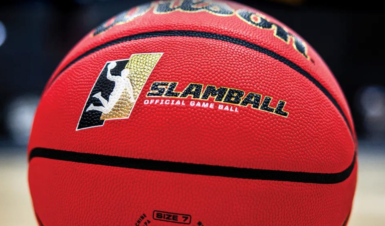
Enjoy the first “MAKING OF” story on the OZONE team of the SlamBall League!
From the earliest sparks of visual inspiration to naming teams, designing logos and uniforms, and outfitting athletes with custom style and fit uniforms, each of the nine episodes unpacks the creative decisions and strategic steps that shaped SlamBall’s electric brand identity from jump.
What Is SlamBall?
SlamBall is essentially 4-on-4 basketball played on a high tension spring-loaded floor with four trampolines inside the arc on each side of the court; in SlamBall it’s called the “launching pad”, and for good reason. It’s full contact sports—body checking is allowed—and fast-paced, with “on the fly” substitutions and hockey-like plexiglass boards surrounding the court instead of out-of-bounds lines. The modified SlamBall court is 96 ft. long x 64 wide, making it a bit larger than a regulation basketball court.
The hybrid game fuses the finesse of basketball, the physicality of football, and the speed of hockey — complete with full-body checks, plexiglass boards, and on-the-fly line changes. The result is a 20-minute game which feels more like a popular video game coming to life.
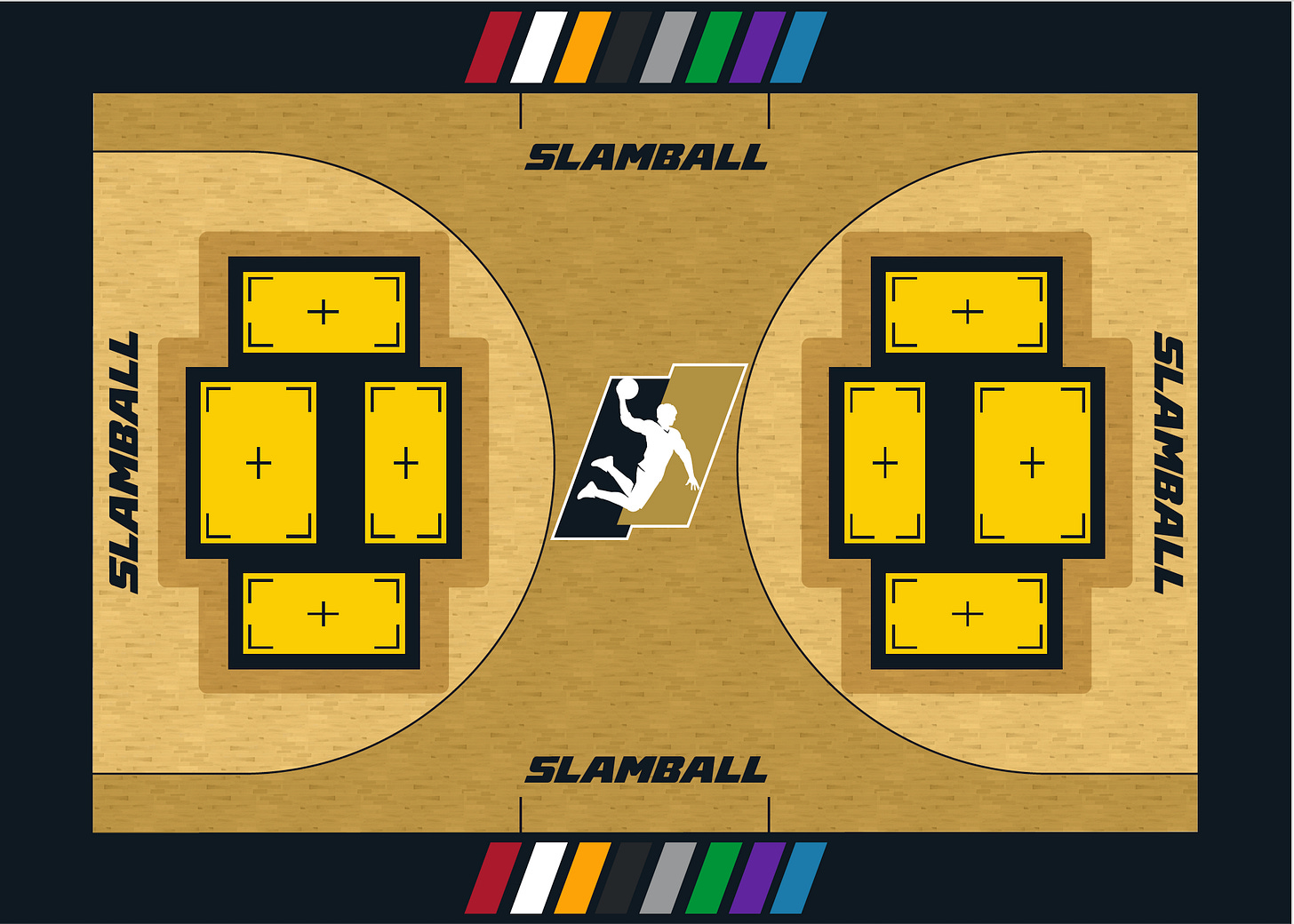
The Return of SlamBall.
After a 20-year hiatus, SlamBall roared back in July 2023, playing at the Thomas Mack Arena, home of the UNLV Runnin’ Rebels, thrilling fans with a high-octane blend of basketball, football, and hockey. Played in four-on-four team matchups packed with explosive dunks and hard-hitting action, the sport which first appeared on SPIKE TV in 2002 returned with a mission: to capture a new generation of fans and ride the momentum of ongoing rising interest in alternative sports.
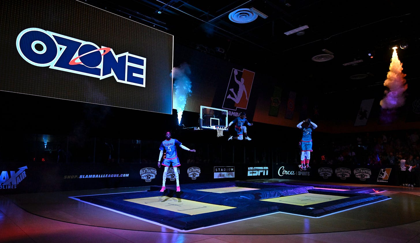
SlamBall is a high-intensity hybrid combination of the best elements of basketball, football and hockey, infused with the essence of a video game that come to life in 20-minute hotly contested games which takes fans breath away.
The Players.
SlamBall athletes are fearless, high-flying, ferocious dunking acrobatics. They launch up to 20 feet in the air, navigate full-contact collisions while executing core basketball fundamentals like dribbling, passing, rebounding and shooting. Player backgrounds include basketball, football, and even gymnastics, sports which bring both raw power and aerial agility to SlamBall which demands these skills — and more.
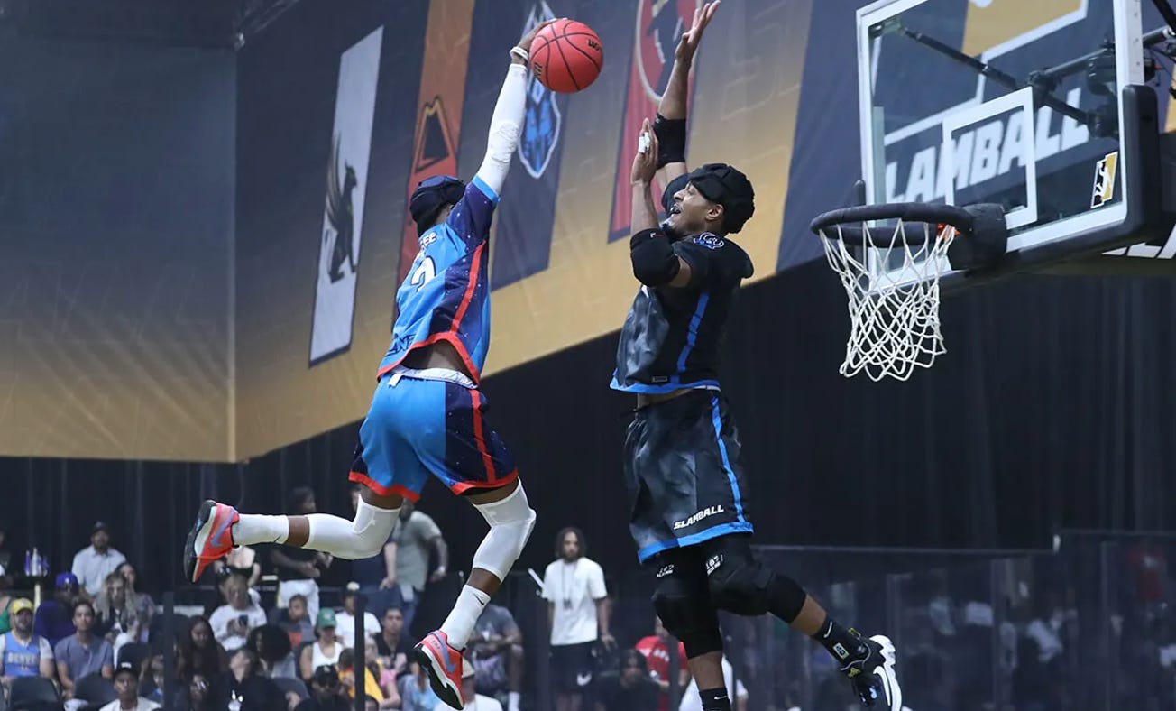
SlamBall dunks are entertaining displays of athleticism with players leaping high above the rim off the high-tension trampolines while football linebacker-sized defenders try to block their power dunks.
Players display the nerve of a trapeze artist as they catapult off the high tension trampolines with burly defenders contesting every dunk.
Building SlamBall. League and Team Branding Process.
The creative objective for the SlamBall League launch? Convey the jaw-dropping athleticism and entertainment experience of the hybrid-style sport with a vibrant, bold and memorable brand identity system.
Our enormous obstacle? Delivering a professional league logo and its’ eight team brand identities in a highly compressed timeline.
As part of accepting the project, league executives informed us they wanted to work with our team to create all the SlamBall brand elements but on one HUGE condition— we only had THREE months to deliver the entire brand identity program! YIKES.
As a comparison, large global outfitting companies Nike, Adidas, and Under Armour often work with a two-year timeline when designing professional and college team logos and uniforms. TWO YEARS!!!
Our creative director, Brigitte Smith and I went to our expansion league and team branding playbook and targeted four key points Gameplan Creative has utilized since the Toronto Raptors and Vancouver Grizzlies NBA launched in 1994.
Having over 30 years experience designing dozens of league and team brands provided our team the utmost confidence to have all the deliverables ready for the SlamBall Opening Tip on EPSN back in July of 2023.
Branding an entire sports league usually takes a year to 18 months minimally—and for a single team often closer to two years. With SlamBall’s tight timeline, we had just three months to deliver it all: a full league identity and eight individual team brands. Partnering closely with SlamBall leadership, Boathouse Sports, and our Gameplan Creative team, we pulled it off—on time, on brand, and to rave reviews. -Brigitte Smith, Creative Director.
A Team by Name Only.
One of the most unique challenges in designing the SlamBall team brands? With all games being played in a single venue in Las Vegas, there was no need for city or state affiliations — meaning no traditional “home” or “away” teams, and no geographic defaults to inspire logos, color palettes, or fan culture.
Each logo includes only a team “nickname” without any connection to a city, event or local relevant history. Our chosen SlamBall team names stand on their own, bold, unique, and became immediately recognizable.
For SlamBall, we felt the most important element of each team’s branding would be a bold, animated team name “wordmark” splashed across the front of the jersey. With fast-paced action and high-flying plays happening every second, fans in the arena and viewers watching on TV needed to instantly recognize players and teams. Without any city names, the importance of eye-catching team names took on a great importance.
The result? Eight unapologetic team names, each as brash, bold, and unrelenting as the players who represented them, which doubles as moving billboards during games.
None of the team names have been used in professional sports which allowed our design team freedom to work without the restraints of looking like an existing club.
• Each SlamBall team logo identity features three colors, providing a range of brand extensions for broadcast, merchandise and social media.
• Team logo designs are designed to feel unique from one another providing each club its own look and voice to build fan support quickly.
• Each team identity also includes an official secondary logo — for uniforms and licensed merchandise, social media, and environmental graphics usage.

SlamBall Sports Branding Case Study: Team One: OZONE.
The team name, OZONE reflects an “above the rim” style of play—high-flying, colorful, and out of this world. Brigitte Smith referenced the NASA library of ozone imagery from the Earth’s atmosphere and was immediately drawn to the beautiful blue glowing horizon which defined her choice for Ozone Blue as the primary team color.
Houston? We Have a Problem… a Good Problem.
Ironically, as both NBA and WNBA Creative Director in the 1990’s, I oversaw the team branding of not one — but two teams — who had space themed nicknames, the NBA Houston Rockets and WNBA Houston Comets. They had identical colors of navy blue, red, and metallic silver with the Rockets having an additional crystal blue for the animated rocket ship orbiting the basketball. So while the Ozone is not a “Houston” based team, there is a understated connection which is an interesting footnote.

Atmosphere Meets Attitude.
The OZONE team identity for SlamBall leans into a bold, space-themed aesthetic, delivering energy and motion through a sleek, futuristic clever team wordmark.
Inspired by the Earth’s ozone layer, our logo solution features a seamless blue gradient that echoes the subtle glow of our planet’s upper atmosphere against the backdrop of space. The central ‘O’ was designed as a distant planet—ringed by red outer band—while rich navy anchors the composition in cosmic depth. Vibrant blues convey the pure, electric energy of the ozone glow, and strategic pops of warm red inject contrast and dynamism, ensuring the brand feels both otherworldly and punchy. -Brigitte Smith, Creative Director.
With extreme deadline pressures, our standard black and white sketch-to-color variation process was fast-tracked. Instead of several weeks of black-and-white concept path, we advanced straight to full-color designs — which were presented, revised, re-presented and —APPROVED by SlamBall executives, all within one whirlwind week! Completely unheard of in professional sports branding.
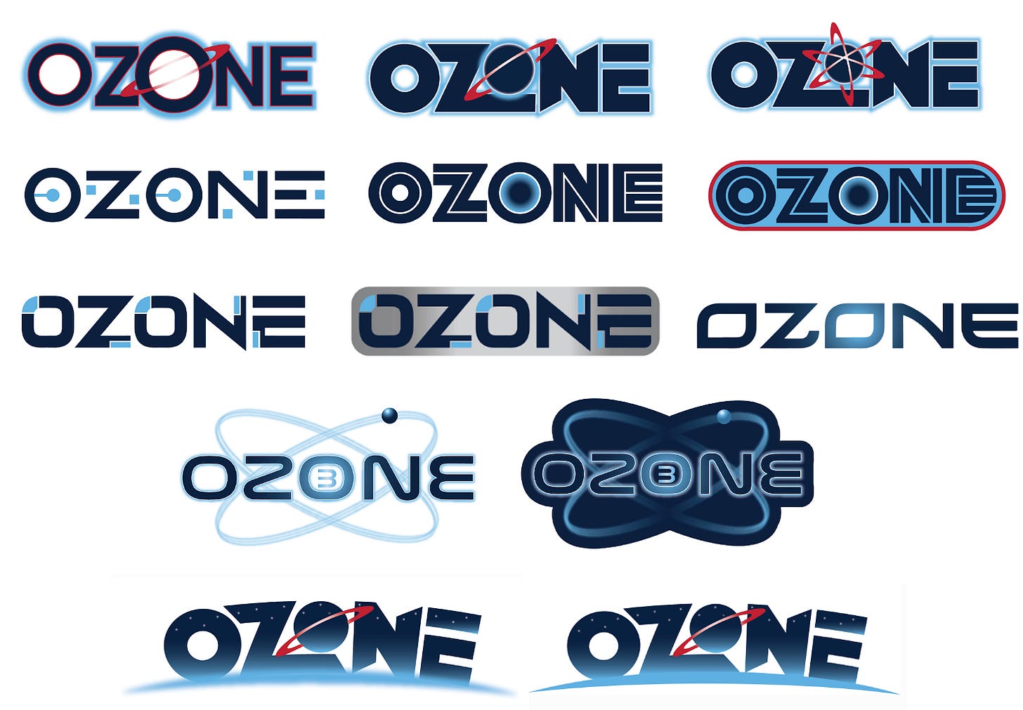
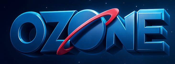
The final OZONE logo features a deep navy wordmark with a dynamic circular ring orbit slicing through the central “O”, symbolizing movement and intensity. Accents of electric blue and red add contrast and a retro-futuristic nod to ‘90s space-themed logos Rockets and Comets. Bold, kinetic, kitchy and unmistakably — SlamBall!
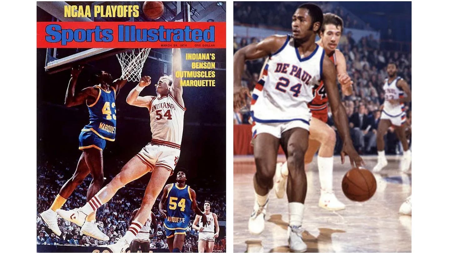
Untucked. 70s College Hoops Uniform Style Vibe Returns.
From the onset, SlamBall players were heavily involved in performance demands for their uniforms. Player input was invaluable since they were participating in a unique sport where both agility and power are the essence of a SlamBall athlete. Decisions whether game jerseys would “tuck” into game shorts were tested and adjusted to satisfy player performance mandates.
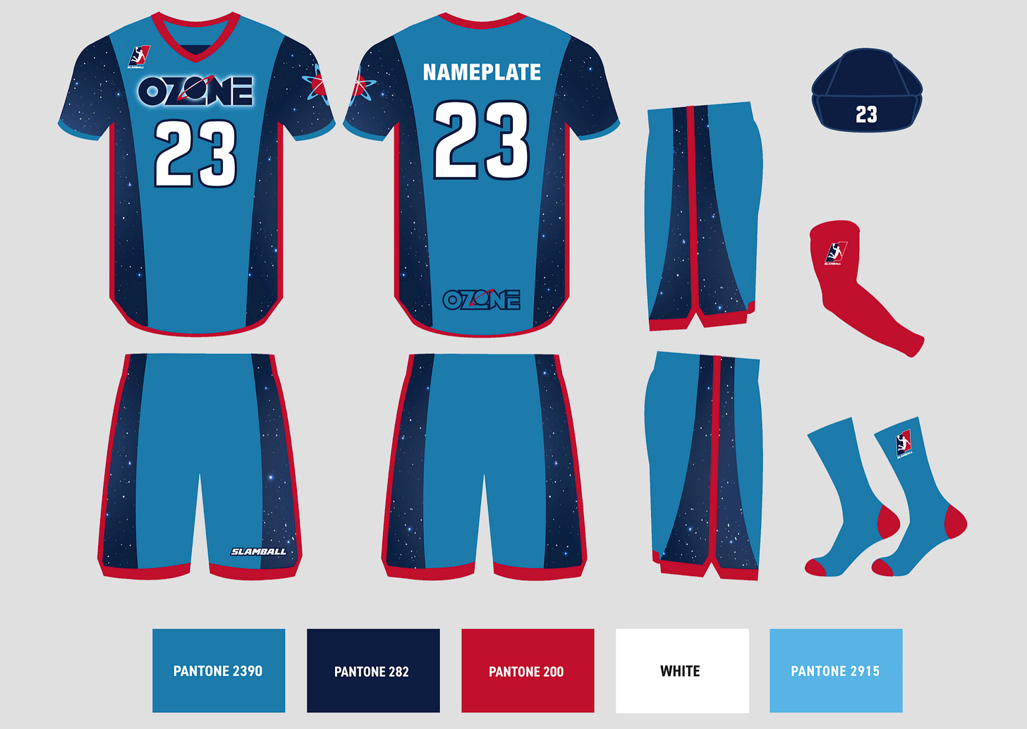
A group of SlamBall players were involved in the uniforms' overall style. Teams feature an identical uniform template with colors, patterns and custom fonts differentiating brand identities from one other.
Freedom Within a Framework.
A key design challenge was to make each team look distinct—within the exact same uniform template. Due to time constraints, all eight teams had to share a common cut and style. Drawing on our extensive experience branding new leagues/teams, we achieved unique identities by using strategic color blocking, custom team-branded patterns, and proprietary wordmark and number systems. The result: eight uniforms that were unified in construction but unique in design and coloration.

Red. White. Yellow. Black. Grey. Green. Purple. Sky Blue. Yellow. Grey.
Without traditional “home” and “away” uniforms, selecting eight distinct contrasting team colors ensured players could quickly differentiate the opposition during games. Red. White. Yellow. Black. Grey. Green. Purple. Sky Blue. Yellow. Grey. Contrasting colors which became the official SlamBall primary team color for the eight squads.
Bold. Bright. Functional.
SlamBall team uniforms are 100% dye-sublimated, providing the lightest uniforms possible. The lightweight material allows SlamBall players to perform acrobatic and artistic slam dunks from 20 feet above the basket without restriction of movement.
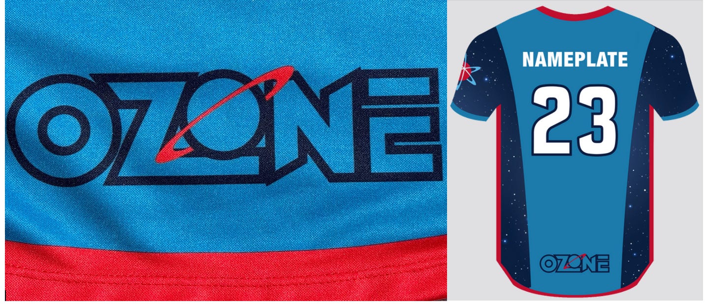
Each team features a branded team name wordmark on the front with an outline team wordmark placed at the lower end of the hem on the back the jerseys.

Each SlamBall team features a unique pattern design (either side panel or front and back) connecting the individual team names and helping extend the brand.
All SlamBall teams feature official team secondary logos on the left sleeve of the jerseys creating a visual standard for the start-up property.
Thank you for subscribing! Hope you have enjoyed Episode 16. Entering the Ozone.
Please keep following us during our nine-story series as we pull back the curtain on how a league identity and its’ eight team brands are created — concept to completion. -The End.


