


Episode 13. NBA Logos Go Full Circle.
What's with Increasing Amount of Cookie Cutter NBA Circle (Roundel) Logos?

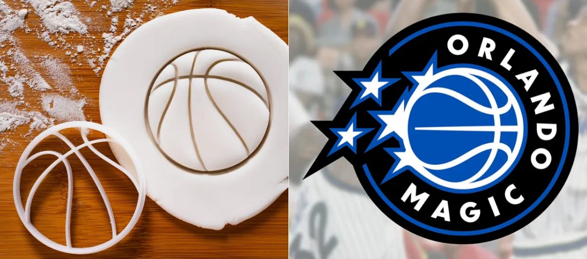
In Episode 13 of the Sports Branding Substack, we’re digging into a question that’s been quietly simmering in the world of NBA identity design, but now has elevated to strong negative feedback with the recent Orlando Magic rebranding.
Why Do NBA Rebrands Look So Similar?
Over the past decade or so, a growing number of NBA team rebrands have defaulted to one design concept: the roundel—a circular mark with the team name wrapped inside an inner circle around the outside of the main icon. Once a rare stylistic choice, the roundel has become the dominant and arguably an overused design element.
What’s driving the sameness in a league once praised for its daring brand identities?
What is a Roundel?

A roundel is a circular emblem, originally from heraldry and military aviation, often consisting of concentric rings with imagery at the center. In the NBA context, it’s become a catch-all design crutch: team name wrapped around a basketball or icon, all enclosed in a tidy circle.

A Design Trend Morphs Into a Design Default.
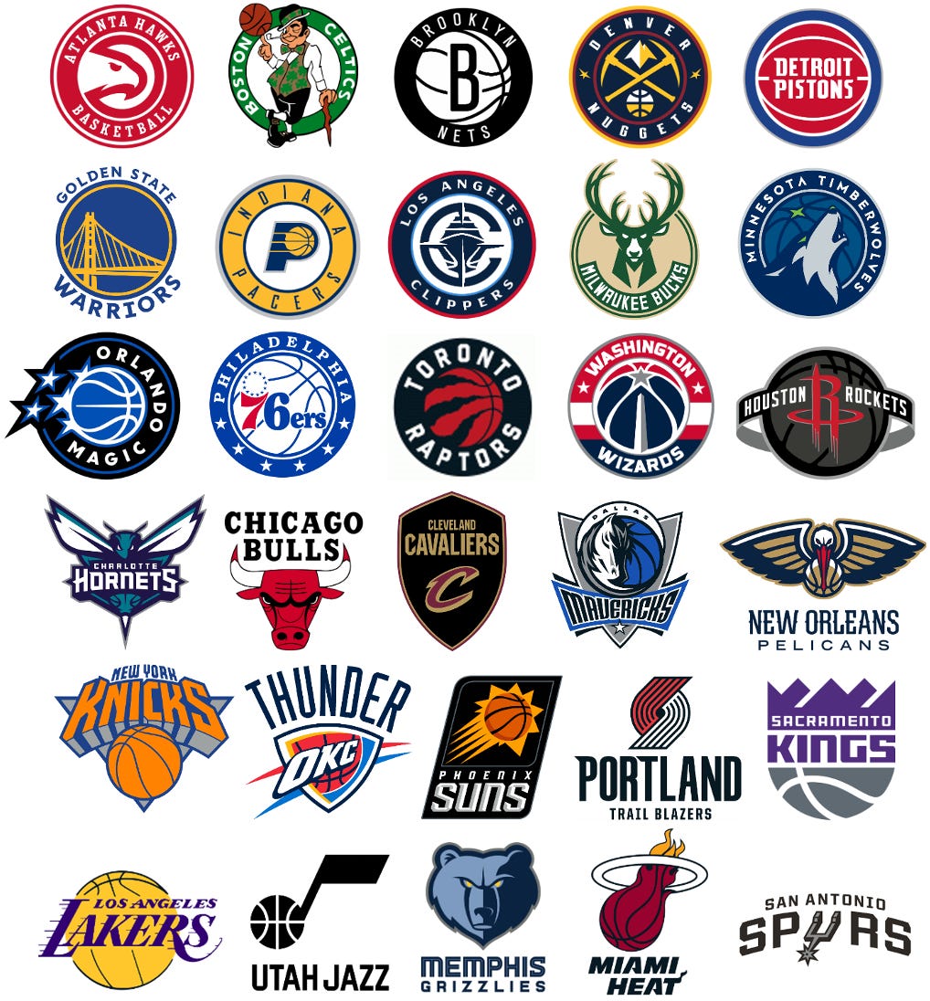
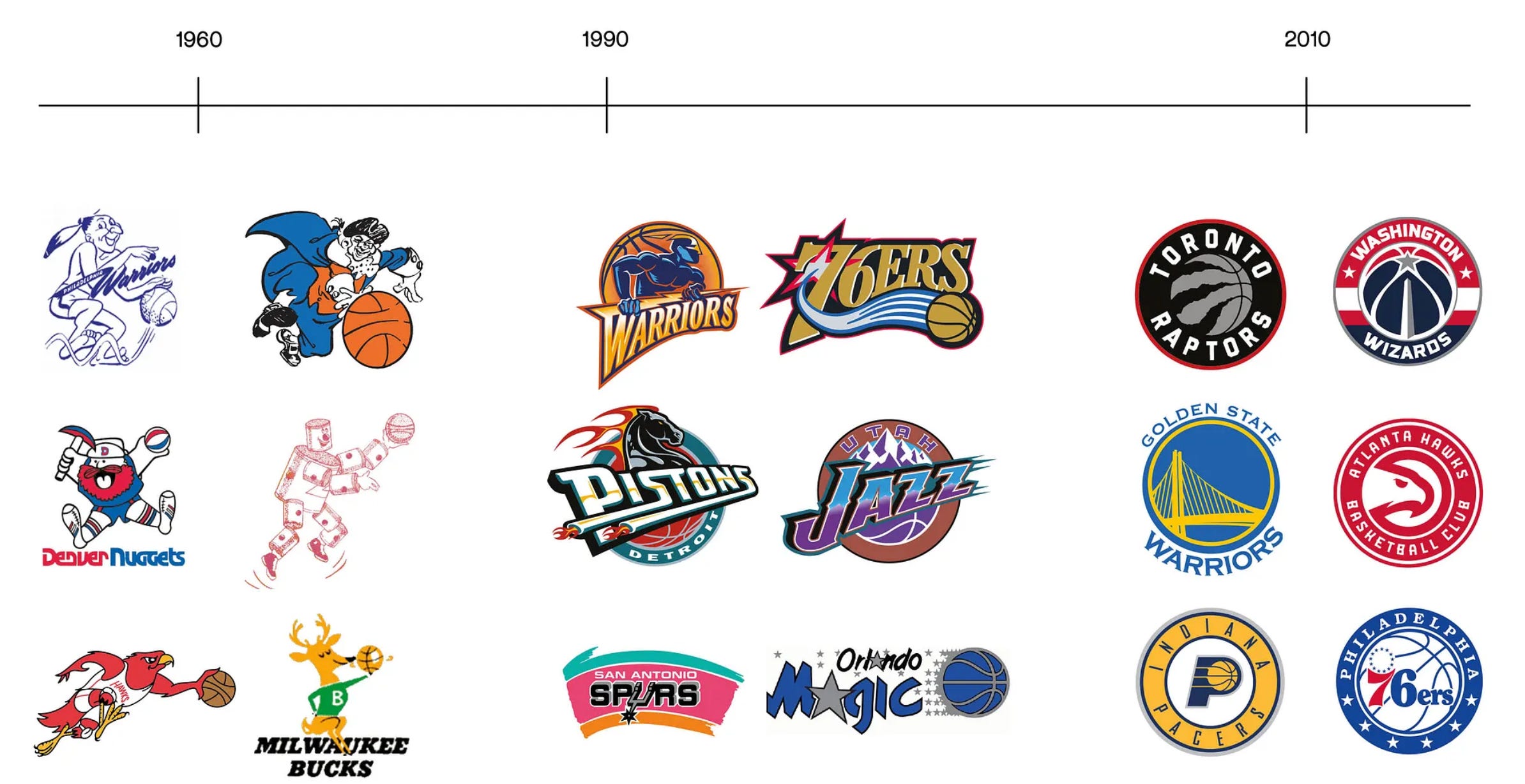
What felt like a short-term trend beginning in the early 20-teens has extended into something else entirely: a design default. Of the 30 NBA teams, 15 now feature a roundel or circular logo—either as a primary mark or an alternate. Boston and Detroit also feature a roundel variation but those logos are “grandfathered in” since they were the circle designs decades before sports branding became a recognized art form.
This shift is more than aesthetic. It reflects a deeper change in design philosophy: a move away from dynamic, character-driven, and often animated marks of the ’90s toward corporate, sterile, and 2-D designs. And fans have taken notice.
A League Full of Energy and Personality. The 1990s.
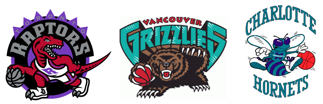
The NBA wasn’t always just a “circles on top of circles” logo collection. NBA team branding like the Toronto Raptors dribbling dino, the Vancouver Grizzlies growling bear, and the Charlotte Hornets teal pinstriped uniforms and cartoony hornet, Hugo were bold, unique and distinctively team-oriented. Everything brand-wise was in play from animated team primary logos, to expressive bold sublimated uniforms, even the courts all had strong brand connections to “tell the team story.”
The NBA Brand Quilt.
In the 1990’s when you laid all 29 team logos side by side, it looked like a colorful quilt—a metaphor I coined during that era to reflect the rich diversity of visual identities across the league. Many shapes, diverse font styles, a wide range of colors and — yes, some logos with a basketball all part of that beautiful NBA quilt.

Fan Backlash to “Cookie Cutter”Logos
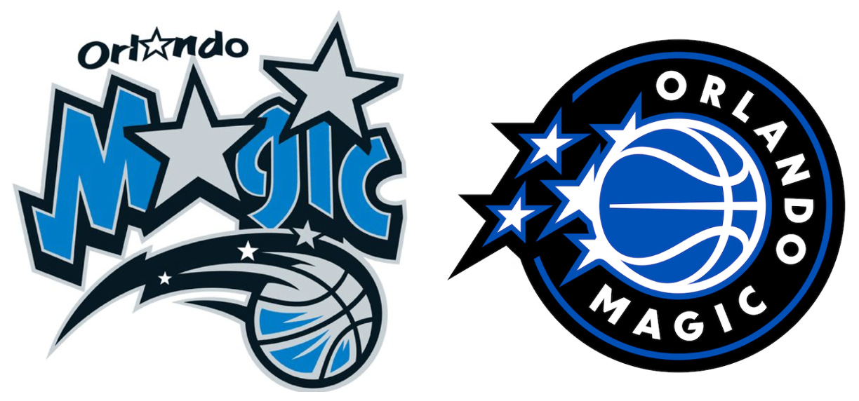
Each new logo unveiling is met with increasing skepticism. Take the recent Orlando Magic refresh: another roundel, another basketball, another interchangeable design.
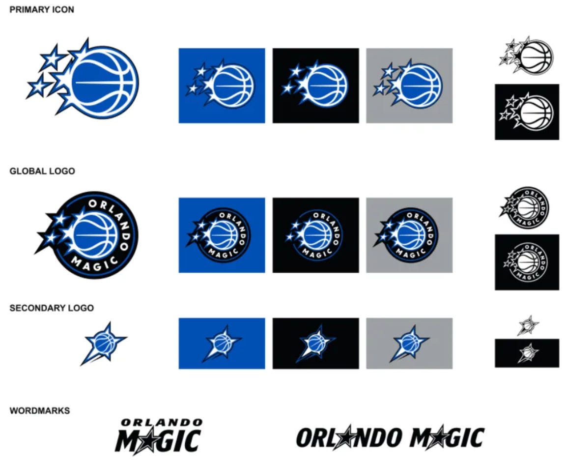
Fans have voiced frustration over what they see as lazy, templated design work—a feeling the logos are no longer expressions of regional pride or team identity, but globally palatable “icons” built for licensing and merchandise sales first. This “homogenous” approach to team logo branding — diminishes the uniqueness of the identity and places it within a brand bucket with many similar roundel solutions.
The result? Cookie-cutter branding lackimg soul and team brand individuality.
How Other Leagues Avoid This Circular Trap.
What makes the NBA’s roundel obsession more noticeable as it increases in quantity? How distinct is that pattern from the three other pro sports leagues in North America?
Let’s take a thorough review of the NFL, MLB and NBA’s primary team logo “quilts”.

• NFL: Team logos here are mostly stand-alone marks—symbolic, sharp, and varied in shape. Think the Patriots’ head, the Vikings’ profile, the Rams’ horn.

• MLB: Most teams still rely on letterforms, classic monograms, or stylized mascots. There’s historical restraint, yes—but also individuality. And the MLB cap with many single or interlocking monograms dominate their visual aesthetics. 4 of 30 MLB teams have roundels: Houston, Seattle, Milwaukee, and Washington.

• NHL: While the NHL dabbles in roundels for alternates or event branding (e.g., Winter Classic), most team marks are aggressive, unique symbols: the Sharks biting through a stick, the Devil’s tail in a “NJ”, the Predators’ sabertooth cat and the classic Blackhawks indian head profile crest.
Roundel designs in those leagues are low in quantity—they are not default branders.
The Beautiful Game and Its’ Roundels.

Globally, the use of roundels in football is fairly commonplace. Many top football clubs feature roundel crests. The main reason? Club sponsors “own” the front of the team jerseys so the reliance on creative, name branded sports branding is very low.
A football crest is the emblem or symbol displayed on a club’s or team’s kits, usually on the chest area and occasionally on the shorts. It typically features a combination of the team’s name, city or region, and visual elements that represent its identity.
Crests have been around for decades, and they serve as a reminder of the team’s legacy, values, and community. Each crest is unique, with its design often telling a story about the team’s origins, success, or traditions. Whether it’s a club from a small town or a globally recognized team, the crest serves as a point of pride for players and supporters alike.
The “Global Logo” Myth.
One theory that persists is that the NBA has quietly pushed for “global logos”—marks that work internationally, feature the full team name, and include a basketball for instant sport recognition.
There is no official NBA league mandate requiring a global logo. None.
While it’s true that teams like the Bulls, Lakers, and Knicks—some of the league’s most iconic brands—have not adopted the roundel approach in their official logos, this hasn’t stopped others from assuming there’s a corporate directive behind the scenes. Such brand “extension” efforts seem more like “designers” making concepts to increase the final invoice —than for a strategic purpose. Less is more, here. The “global icon” idea seems to be more of a branding myth than a league requirement. It may be encouraged in some creative briefs, but it is not enforced by any means.
Also… there is NO official NBA branding rule every logo must include a basketball!!!
Final Thoughts: A Yearn to Return to Creativity.
The NBA has always been a culture-first league. It’s driven by music, fashion, city pride, and individual player personalities. The design language should reflect that. Instead, many recent rebrands feel like they’re built for PowerPoint decks, avatars and licensing guides—not for passionate fans, dynamic storytelling or shear FUN!
The league and its fans deserve better than safe, circular roundel logo designs.

Here’s hoping the next wave of NBA identity design brings back some of that rebellious spirit. When every team logo is a circle, nobody stands out. -The End.