


Episode 7. Designing Like a Rockstar.
Producing a Smash Hit Brand Identity with Jon Bon Jovi.

It’s My Life.
Every once in a great while, a project comes along that’s so surreal and so memorable, it makes you stop and say—did that really happen? One of those rare career moments allowed me to combine three personal passions: sports, branding, and music. But not just any music. Rock anthem type stuff. The kind of rock you crank up with the windows down. The kind that fill stadiums across the globe. Think Rock and Roll Hall of Fame royalty…
This Substack “Designing Like a Rockstar” pulls back the curtain on the electrifying creation of a brand-new Arena Football League team—an unforgettable fusion of sports, spectacle, and rock ‘n’ roll. This is the untold story of how I helped shape the identity of a rising franchise while collaborating directly with one of the world’s biggest music icons—none other than Jon Bon Jovi of BON JOVI fame. From brainstorming with Jon while he’s on tour to a high-octane design on the fly process , it’s a front-row seat to what happens when sports branding meets rock stardom.

This is the behind-the-scenes story of how the Philadelphia Soul became one of the most unique and enduring brand identities in Philly sports history, and my good fortunate to create it with a rockstar!
My Work Here is Done.
After 15 exciting years as the NBA’s first creative director (starting in 1990), I’d helped transform basketball into a global phenomenon. My creative services team and I redesigned logos for most NBA teams, created the WNBA from the ground up, and marketed the legendary 1992 Dream Team. By the early 2000s, the NBA was thriving, but I felt ready to use my creativity and branding skills in new ways—beyond just sports. It was time to take what I’d learned and search for fresh new challenges outside the basketball world.
Enter NVU Productions, a hot Chicago-based creative agency that was melding the worlds of sports, music, and pop culture. They were behind highly visible campaigns for Britney Spears, Aerosmith, and more. I joined in 2003 and immediately brought in both the NBA and MLB as clients—yes, I went from creating great work inside the league to pitching fresh new ideas to them as an external creative resource.

This Left Feels Right.
The connection with Bon Jovi? It came through music first. Steven Tyler (yes, that Aerosmith Steven Tyler) suggested Jon reach out to NVU for help naming his new upcoming album. That project turned into the 2003 release This Left Feels Right —and somewhere in the mix of those hurried calls and “what if” brainstorming sessions, Jon learned about my background in sports branding.

That’s when Jon reached out to me: “Hey, I own a new Arena Football League team in Philly. I want it to be different. I heard of your sports work…. want to work together?”
My answer? Absolutely.
A First for me… 25 Years Later.
Although I had already built a solid foundation designing for basketball teams and major events, this marked the first time in my 25-year career I’d be stepping into the high-impact world of professional football branding. And it was unlike anything I had experienced before. The sheer contrast between the two sports—especially in terms of gear, energy, and visual language—was staggering. Football isn’t just a game; it’s a battlefield.
This Soul project pushed me to rewire the way I thought about identity design. Suddenly, I was working with bold, oversized helmet decals, aggressive typography, and intimidating face masks that felt more like armor than athletic equipment. Every element screamed intensity, power, and presence. I was no longer designing for finesse and fluidity—I was designing for force and fearlessness.
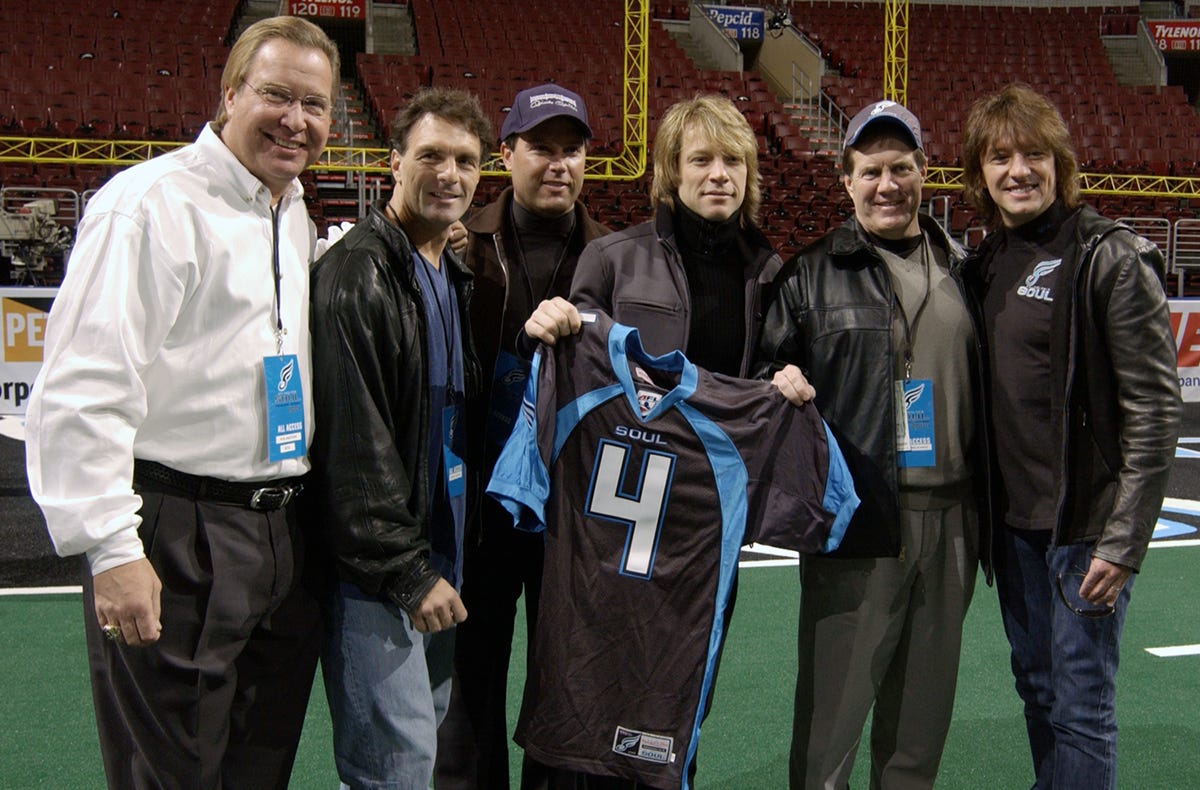
Even better? Jon wasn’t an absentee celebrity owner. He was very hands-on. Engaged. Texting me design thoughts directly. His number lived in my Motorola RAZR at the time—proof of just how exciting this collaboration was. I felt like a band member…

Evolutionary Brand Identity.
Building an expansion teams’ identity is like producing a new product line. Jon focused on positioning the Philadelphia Soul organization as an “evolutionary” Arena Football League property; equal parts entertainment… mixed with success on football field.
His vision? Make the Soul a lifestyle choice for Philadelphia sports fans... yes, championship caliber football... but it needed to be more than just a game. He felt the Arena Football League should be a highly entertaining product which featured the game of football at its center.
The Philadelphia Soul brand identity creative brief mandate was simple. Make the Soul identity memorable, relevant to its fans, players and the broader market. The new image should create brand clarity with a touch of personality allowing the Soul to have its’ own unique character. The new logo should not be trendy --- and be easily recognizable.
Authenticity Over Gimmickry.
The Soul branding process was built around one of Jon’s strongest instincts—authenticity. He didn’t want skulls, flames, or guitar riffs in the logo. No cheesy rock references. “This isn’t about me,” he said. “It’s about Philly. It’s about the fans. Let’s make something real.”
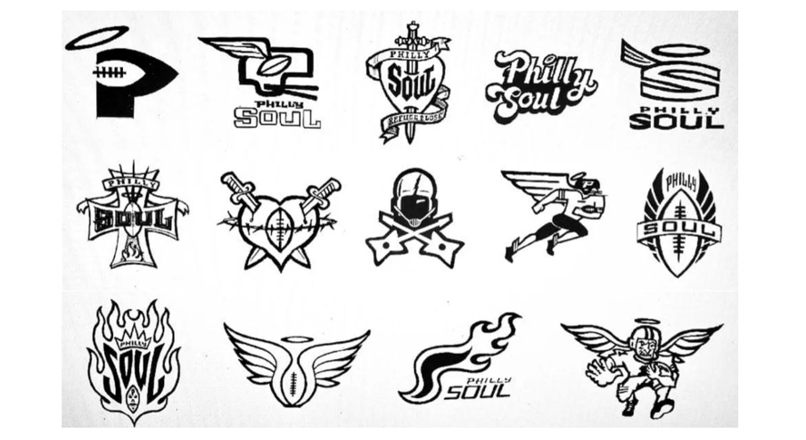
Jon’s mandate helped clarify everything. The Soul had to feel fresh and modern, but also grounded in Philly’s blue-collar pride and music roots. We took inspiration from the “Philly Soul” genre—smooth, but powerful—and combined that with the fast-paced energy of Arena Football. Designing a legacy with soulful simplicity and style.

The new team brand creative brief was built on a logo that avoided fleeting trends, opting instead for enduring recognition. Drawing inspiration from the Philadelphia “Philly Soul” music style blended with the AFL’s fast-paced 50-yard war sport.
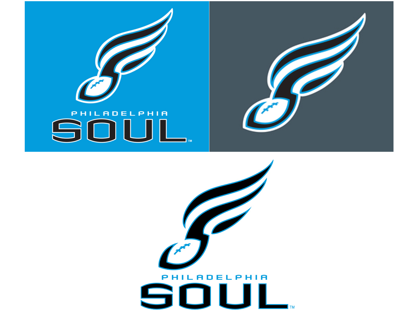
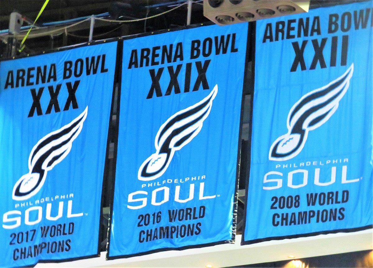
The final result? A clean memorable logo which matched up with Philadelphia’s no nonsense attitude and the Soul’s meteoric rise as a new team in league which included the 2008 AFL Championship… all in a short four season span. Beyond aesthetics, the brand became a rallying point—a “lifestyle” that merged game-day passion with local community pride.

Between Heaven and Hell… is a Little Rock ’n’ Roll.
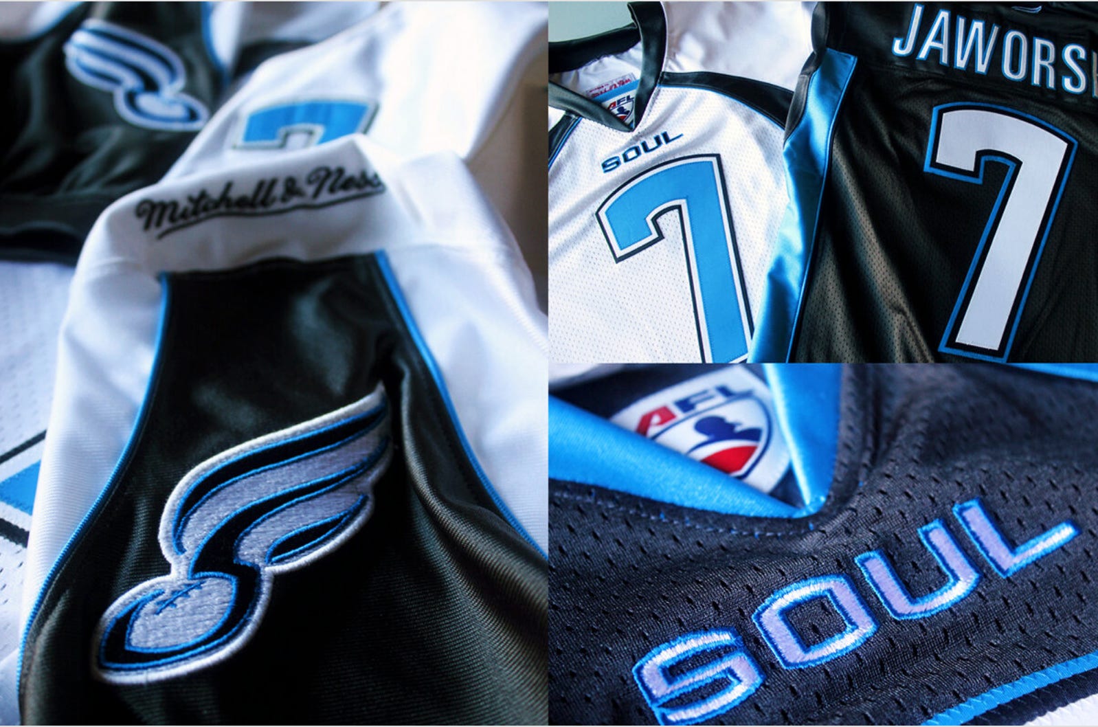
Color inspiration came from the unlikeliest of places: a rock art book on my desk at the NVU Productions office in Chicago. Jon picked up The Art of Modern Rock book, flipped it over, and locked in on the back cover—a cool angelic sky blue figure paired with deep charcoal gray tones and outlined in black.
“These colors just feel right,” Jon said. The color combination of Sky Blue. Graphite Grey. Midnight Black. The team color palette was established early on in the process.

The Crown Jewel: The Helmet.
In football, while the primary logo is a key visual identifier—but it’s the helmet that drives the brand. It’s the gladiator symbol… those large stickers, the protective mask real primitive stuff.
Jon wanted the soul helmets to stand out… bad ass as he described. I proposed a grey metallic coating with fleck highlights, something sleek. Jon loved the idea… however Riddell Sports, the helmet vendor didn’t stock the grey coating color he wanted.
So what did I do? I had to improvise… and fast.
I hit the auto dealerships looking at new cars in different shades of graphite grey, and after a long search found the perfect match in a Lexus color swatch—called Graphite Silver with Shimmer. I sent the paint chip color to Riddell Sports, and within a few weeks, a Soul helmet in that exact tone showed up at my office. Jon’s vision, realized.

Mitchell & Ness: Hometown Heroes.
When Nike passed on outfitting the Soul (they didn’t see retail potential in the AFL?), I turned to Mitchell & Ness, the Philly-based kings of throwback sports fashion. Once Bon Jovi’s name came up, they were all in. The result? An NFL quality, authentic uniform design, plus the hometown credibility that Nike couldn’t simply deliver.


Livin’ on a Prayer.
Working with Jon Bon Jovi wasn’t just a celebrity collab—it was a lesson in strategic creativity. He had incredible instinct for what would resonate with fans, and his passion was contagious. The Philadelphia Soul became more than just a football team. It became a feeling. A lifestyle. A symbol of pride. It fit Philly like a glove.
And years later, when I see that helmet, that logo, those colors—I smile. Not only was it a cool design, but because it was built with heart, with purpose, and with a rockstar who truly got sports branding.
The Soul Curtain Call.
Sports branding isn’t just about design—it’s about emotion. About creating a brand connection that sticks. With the Soul, we didn’t just design a logo, we composed a brand anthem. Over the years, the AFL has had many starts and stops but the 2004 Soul brand identity was one HUGE brand positive… thanks to a rock star. -The End.
 | A guest post by
|
Great read Tom! Thanks for sharing!