


Episode 3. Brand Wizardry.
The Whimsical Transformation from Bullets to Washington Wizards.

In the 1990s, as Washington, D.C. faced a surge in gun violence, the NBA team name "Bullets" drew criticism for its association with crime. Team owner Abe Pollin, deeply affected by the assassination of his friend Yitzhak Rabin, deemed the name "violent and offensive." Motivated by a desire to foster positivity and social change, Pollin decided to rebrand the team, marking a pivotal shift in its identity.
Social Change in Society and Basketball.
For the 1996-97 NBA season, Pollin petitioned the NBA Board of Governors to change the name of his team from the Washington Bullets to Washington Wizards. The vote to approve the changed by the NBA steering committee was unanimous.
The Washington Bullets’ rebranding to the Wizards in 1997, orchestrated by owner Abe Pollin, remains a pivotal case study in NBA team identity evolution, blending social responsibility with design innovation. The shift was driven by Pollin’s desire to dissociate from gun violence amid D.C.’s 1990s crime crisis, but the execution of the new brand diverged from era trends and while sparking debates about cultural relevance.
Tom O’Grady, the NBA’s first Creative Director and former SVP of Creative Services, revolutionized the league’s branding by building its in-house marketing department. He led the redesign of over 50 NBA team logo rebrands and created the original eight WNBA team logos. His work extended to designing uniforms for USA Basketball at the 1992, 1996, and 2000 Olympics, as well as branding for marquee NBA events like NBA All-Star Weekend, NBA Playoffs, and the NBA Finals.
In June of 1995, O’Grady was informed by legendary former NBA Commissioner David Stern, he would spearhead Washington’s rebrand efforts for the league – an critical assignment understanding the political sensitivity of moving from such a controversial team name in Bullets.
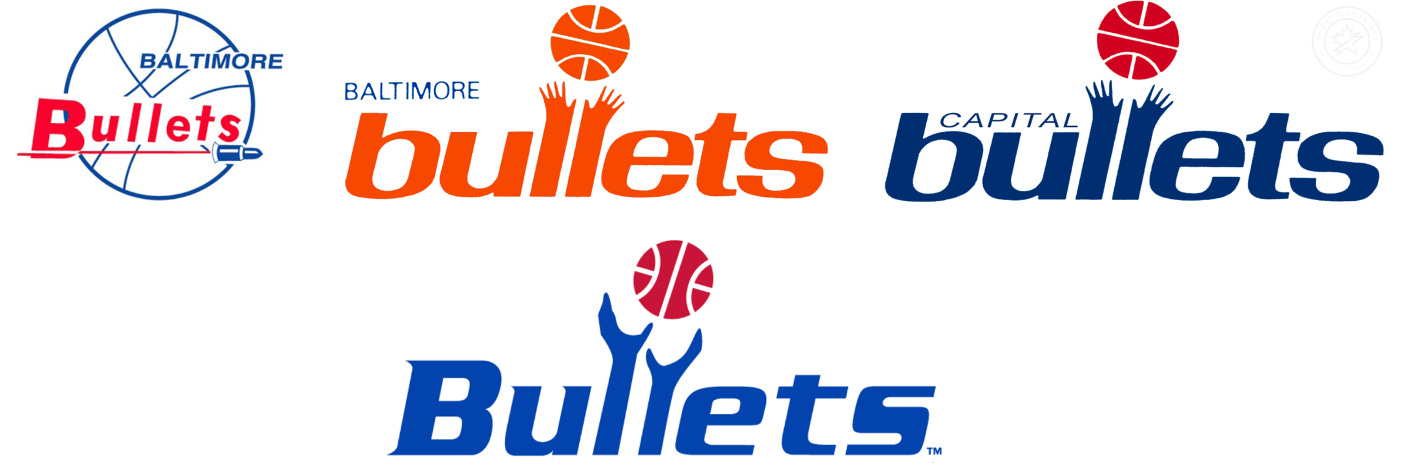
The Washington NBA franchise used the name "Bullets" for 24 years from 1974 to 1997. With the name change they would need to be treated as an “expansion team” from a brand buildout standpoint.
O’Grady and his powerhouse 25-person in-house creative staff would be working with the NBA Washington ownership, front office and marketing staffers – and even forward Juwan Howard, who was coming off an All-Star season in D.C. – to be a part of the brand development process.

Abstract Over Illustrative.
Once the “Wizards” team name cleared legal review the name was set in stone. All that was left was building the brand around it – and a new fresh look that fit the name and stood out from other NBA team brands around the league and professional sports.
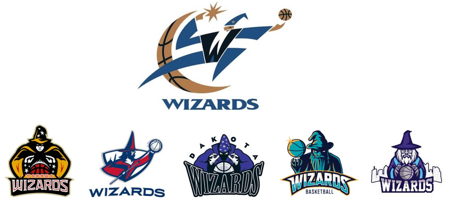
It did not take long for the NBA, the Washington executive management group and NBA Creative Services to focus on a direction that was not overly animated. Doing research, the NBA found many other “Wizards” logos using caricatures of old wizards while looking into a crystal ball. The style of an old wizard simply does not have athletic movement nor clean lines for a sports team logo and identity.
“I felt like we needed something that was clean,” O’Grady said. “Something very different from what was happening around the sports world then. The cartoony pendulum has swung way too far to a busy animated look. I suggested swinging it back to a modern classic feel and it make it more interpretive to the fan/viewer. We decided to go clean and very simple — and everyone was on board.”
The overwhelming popularity of the eye-popping, mascot-focused designs of the time was no coincidence, as computer technology quickly progressed in the early-to-mid 90s and graphic design software like the newly introduced Adobe Photoshop took hold of the industry. Graphic designers had freedom to take their creative concepts further than ever before – and brought to life bold, busy and complicated brand designs. Animated animals, heavy drop shadows, two-tone color gradients and three-dimensional logos were everywhere —and they were selling billions of dollars of merchandise in the sports licensed business, which was exploding sales wise.
Look back to look forward.
The design mandate was set: buck the trend by creating a Wizards concept that would be modern and clean – almost classic in nature. Something abstract and whimsical that would stay fresh for years to come.
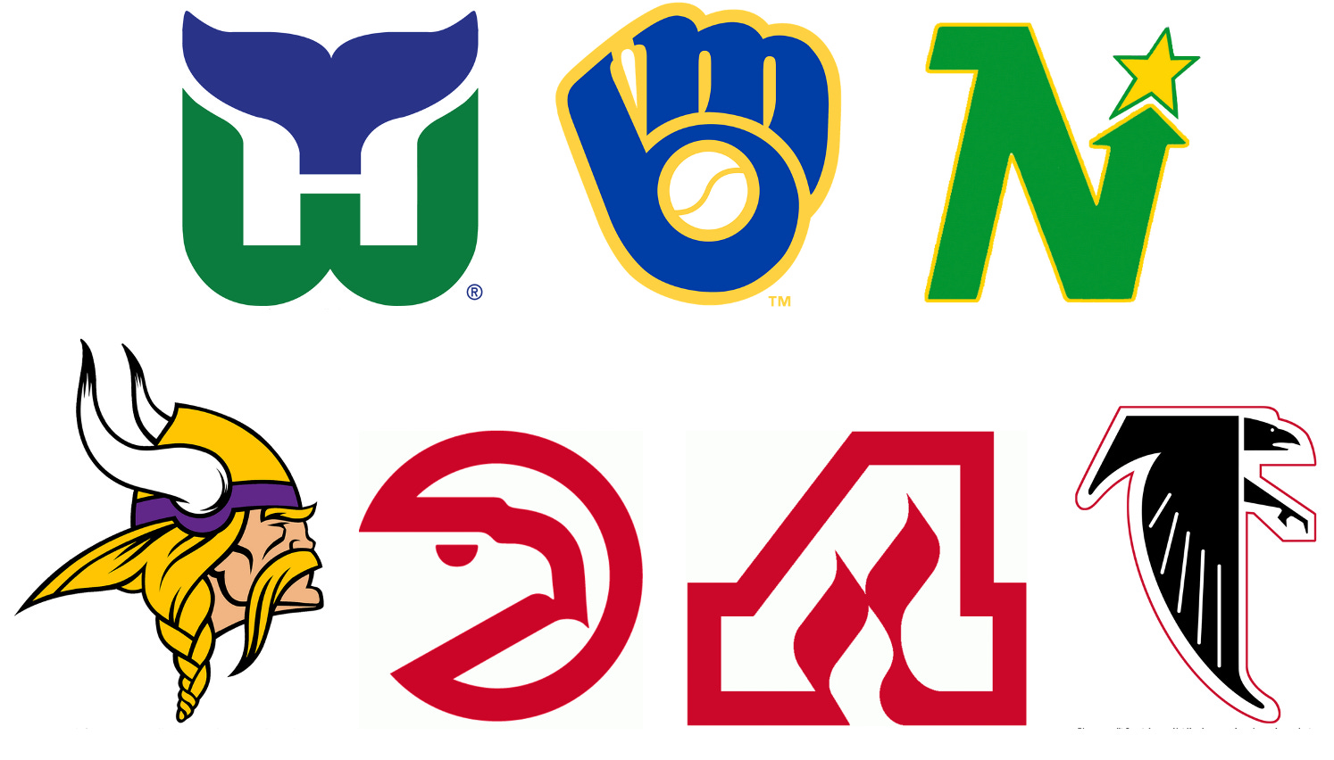
The design team referenced popular ‘70s retro team logos like the Hartford Whalers, Milwaukee Brewers, Minnesota North Stars and Vikings, Atlanta Hawks, Flames, Falcons and other ultra-simple logo designs which all featured clean, bold shapes with minimal extraneous lines or colors.
With the new look set to debut ahead of the 1997-98 season, the Wizards and NBA needed a final primary logo by May 1996. Step one for O’Grady and his team were logos. The first presentation – included eight to 10 black-and-white logo concepts which laid the foundation for the brand. While the team made swift work of the initial concept of clean and simple, the design process was a multi-stage process.
Draft after draft, bouncing back and forth to find the fine line between memorable yet not busy nor too literal kept the team busy for weeks. What seem to work well on paper sometimes did not translate to a jersey – or what may have been viewed perfectly on a television broadcast did not translate on a t-shirt graphic.
A Whimsical Wizard.
Once the design team eventually landed on the abstract wizards icon as the primary team logo design, they applied the swooping team wordmark lettering which graced the front of the jerseys, bold clear player numbers and player name lettering which became the popular uniform designs.
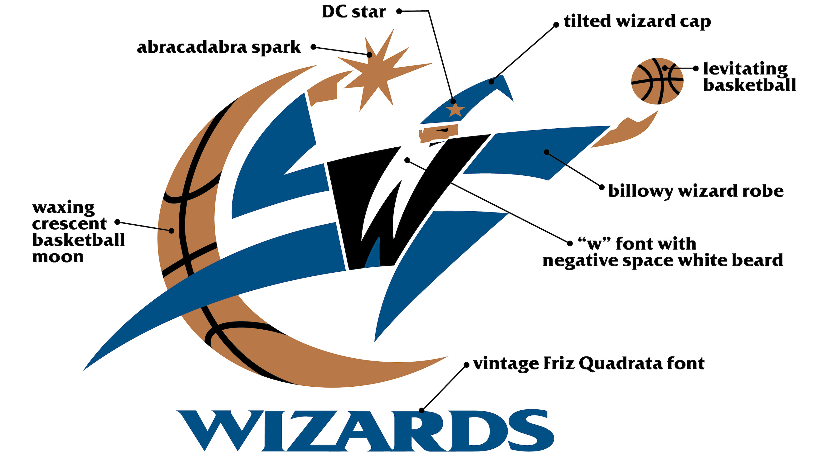
“Personally, the end result represents one of my favorite team designs I’ve done since joining the League back in 1990. The whimsical Wizards font with the bold W and sweeping font cross the jersey front punctuated with a crescent moon dotting the ‘I’.” - Tom O’Grady. ex-NBA, SVP of Creative Services.

In the ongoing brand design process, O’Grady stumbled upon the idea for a secondary logo that has stood the test of time – and even found a home outside the Wizards’ brand. “When designing the Wizards’ ‘W’ I began playing around with the concept for a secondary District of Columbia logo,” O’Grady said. “I am especially proud of the ‘dc’ since it lived on as the secondary logo for the Washington Mystics WNBA team who have the used the design for years.”

Next, it was time to bring the new design to life with a color scheme. With a few strong concepts in mind that would align with the “Wizards” name, the team did not need to look far for the inspiration that pushed them toward their final decision.

“We followed the Capitals branding change and said let’s maybe not overthink that and I really liked having the same colors in the building between basketball and hockey. It was not a long process of trying different color variations. We moved to that quickly.” -said O’Grady.
And it was a new color scheme in the NBA as no team had that slate blue, metallic bronze and black combination. It was fresh. It wasn’t teal, it wasn’t purple. It was an interesting deep smokey blue, which ideally fit the feel of a wizard. The bronze was also different. And the black of course, was so popular back in the 90s.

The color scheme of slate blue, bronze and black– worn by franchise greats that include Juwan Howard, Rod Strickland, Gilbert Arenas, Antawn Jamison, Caron Butler and John Wall – was a significant departure from the team’s original red-white-and-blue look that defined most of the franchise’s history.

Arriving on the final look – including the logo, color scheme, uniforms, court and more – was a year long, all-hands-on-deck process with input from the NBA league office and many different layers of the Wizards’ organization.
There was a move afloat to add an black alternate Wizards uniform when Michael Jordan joined Washington for the 2001-2002 season, and prototypes were in development. However, due to the 18-month turnaround Nike needed to produce the replica and Swingman jerseys overseas, the project never happened and Jordan played only two more seasons before retiring for good.

While the identity was initially met with mixed some reviews, when the Wizards reintroduced design in the 2022-2023 season, fans clamored for the team to make the design permanent once more. Wizards designer Tom O’Grady longed for the blue, bronze and black identity and referenced the amount of team uniforms today.
The 1990s NBA Branding Hit Different.
“Personally, it’s just like seeing an NBA game from the 90’s and how different and striking it looks even today,” O’Grady said. “And how you can tell immediately what teams are playing and where they’re playing. It’s like a familiar song you never really stopped loving... It’s less about just nostalgia and really it’s more about wearing great uniforms with creative designs — which never goes out of style.” -The End